
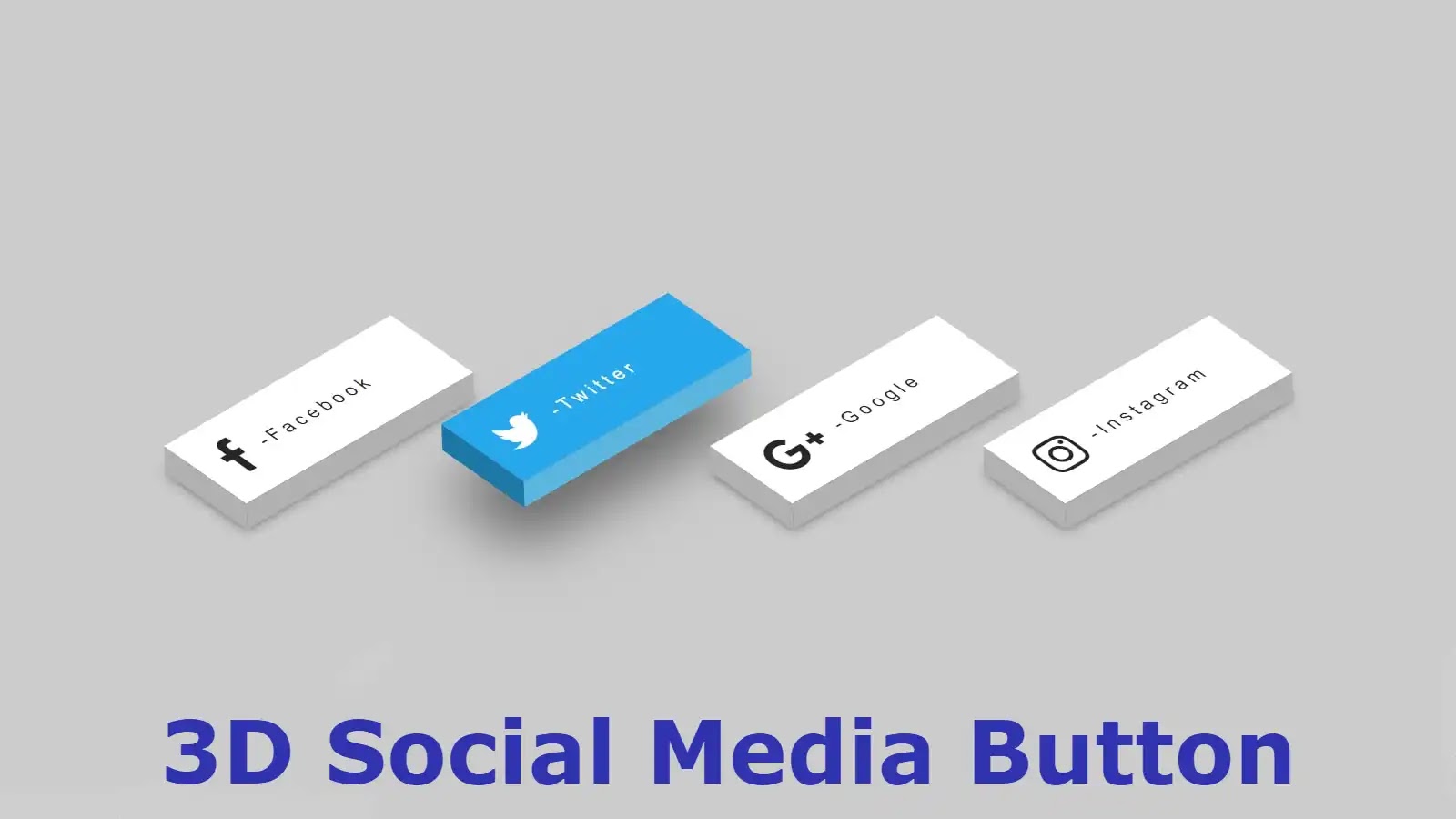
Hello friends, in this article I have shown you how to easily create 3D social media buttons using simple HTML and CSS programming code. This type of button can be noticed in a lot of websites nowadays to increase the quality and beauty of the website. 3D buttons are much more attractive than normal distribution so such buttons have gained a lot of popularity nowadays.
In this article, I have made 4 social media buttons. Here I have tried to explain to you step by step how these are made and what kind of programming code is used to make them. Earlier I shared with you how to make different types of social media buttons.
Hope you like these buttons. 3d is a type of modern design consisting of three dimensions. It is much clearer and brighter than the two dimensions. These social media buttons have been designed with different colors and hover animations have been added.
Video tutorial on making social buttons
The following video will completely help you to create these icons on social media. If you want to know step by step, you must watch this video.
Hopefully, you have learned how to make these buttons from the video above. Below I have basically shown how it is built step by step using programming code. Hopefully, the tutorial below will help you to increase your knowledge of HTML and CSS programming.
3D Social Media Buttons CSS
To create these social media buttons, you can download the required HTML and CSS code for free by clicking on the download button above. Copy the structure below and add it to your HTML file. The following instructions give complete instructions on where to add HTML and CSS code. You add HTML and CSS codes accordingly.
If you want to know how to make it step by step and want to know which programming code has been used to make which element. However, follow the tutorial below.
Step 1: Create 4 buttons
The following programming has been used to create these buttons. These are the HTML programming codes that make up the 4 social icons and text here.
<ul>
<li>
<a href=”#”>
<i class=”fa fa-facebook” aria-hidden=”true”></i>
<span> -Facebook</span>
</a>
</li>
<li>
<a href=”#”>
<i class=”fa fa-twitter” aria-hidden=”true”></i>
<span> -Twitter</span>
</a>
</li>
<li>
<a href=”#”>
<i class=”fa fa-google-plus” aria-hidden=”true”></i>
<span> -Google</span>
</a>
</li>
<li>
<a href=”#”>
<i class=”fa fa-instagram” aria-hidden=”true”></i>
<span> -Instagram</span>
</a>
</li>
</ul>
Step 2: Make the links and text beautiful
The following programming codes basically make the text and links beautifully colorful.
body{
background: #ccc;
font-family: ‘roboto condesed’, sans-serif;
margin: 0;
padding: 0;
}
ul{
position: absolute;
display: flex;
margin: 0;
padding: 0;
top: 50%;
left: 50%;
transform: translate(-50%,-50%);
}
ul li{
list-style: none;
margin: 0 5px;
}
Step 3: Turn the links into buttons
These codes have helped to make the links into buttons and to design them.
ul li a .fa{
line-height: 80px;
transition: 0.5s;
padding-right: 14px;
font-size: 40px;
color: #262626;
}
ul li a {
display:block;
padding-left: 20px;
text-decoration: none;
transition:.5s;
width:210px;
display:absolute;
text-align:left;
box-shadow: -20px 20px 10px rgba(0,0,0,.5);
transform: rotate(-30deg) skew(25deg) translate(0,0);
height:80px;
background: #fff;
}
ul li a span{
transition: 0.5s;
padding: 0;
margin: 0;
top: 30px;
color: #262626;
letter-spacing: 4px;
position: absolute;
}
ul li a:after {
transform: .5s;
content: ”;
position: absolute;
bottom:-20px;
height:20px;
width:100%;
background: #b1b1b1;
left:-10px;
transform: rotate(0deg) skewX(-45deg);
}
ul li a:before {
content: ”;
background: #b1b1b1;
top:10px;
position: absolute;
transform: .5s;
left:-20px;
height:100%;
width:20px;
transform: rotate(0deg) skewY(-45deg);
}
ul li a:hover{
transform: rotate(-30deg) skew(25deg) translate(20px, -15px);
box-shadow: -50px 50px 50px rgba(0,0,0,.5);
}
ul li:hover .fa{
color: #fff;
}
ul li a:hover span{
color: #fff;
}
Step 4: Make it animated
The following codes make these buttons animated and colorful. Here different colors are used for each composition. Here you can change the color of your choice if you want.
ul li:hover:nth-child(1) a{
background: #3b5998;
}
ul li:hover:nth-child(1) a::after{
background: #4a69ad;
}
ul li:hover:nth-child(1) a::before{
background: #365492;
}
/*2nd*/
ul li:hover:nth-child(2) a{
background: #00aced;
}
ul li:hover:nth-child(2) a::after{
background:#53b9e0;
}
ul li:hover:nth-child(2) a::before{
background: #097aa5;
}
/* 3rd button*/
ul li:hover:nth-child(3) a{
background: #dd4b39;
}
ul li:hover:nth-child(3) a::after{
background:#e66a5a;
}
ul li:hover:nth-child(3) a::before{
background: #b33a2b;
}
/* 4th botton*/
ul li:hover:nth-child(4) a{
background: #e4405f;
}
ul li:hover:nth-child(4) a::after{
background:#e46880;
}
ul li:hover:nth-child(4) a::before{
background: #d81c3f;
}
Hopefully, the other tutorial has helped you to create this social media button. If you have any difficulty understanding the tutorial above, you can watch the video above. If there is any problem, you can comment and ask.
You can watch the live demo of these buttons by clicking on the demo link above. You can also download the required code for free by clicking on the download button above. Special thanks to you for reading to the end of the article.
