How To Create Pop Up Login Form Using HTML and CSS

How To Create Pop Up Login Form Using HTML and CSS

How To Create Pop Up Login Form Using HTML and CSS

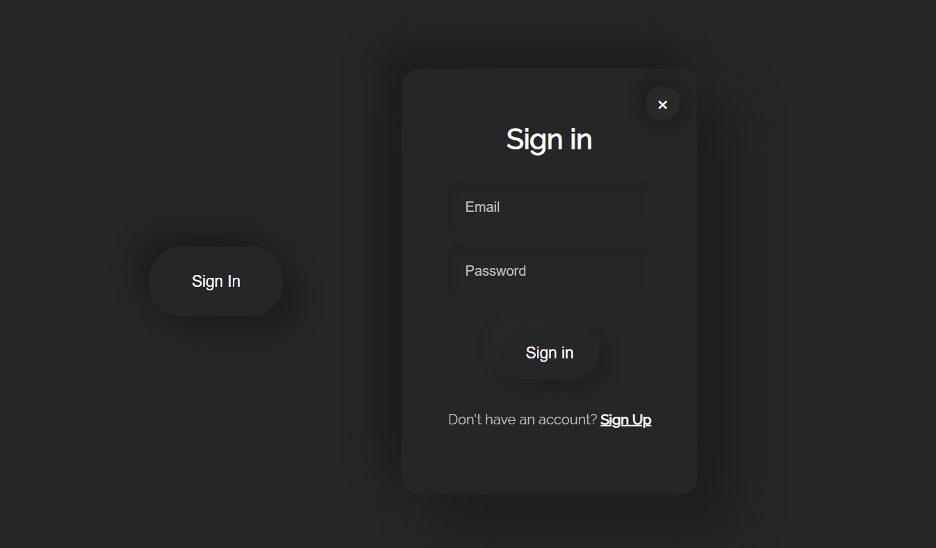
The pop-up login form is a modern type of login form design that is very popular nowadays. In the case of this type of design, the login form is completely hidden.

Normally we see a button or link. Clicking on that link shows the complete login form design. There is a cancel button that, when clicked, hides the log form again.

Hello friends, today I am going to show you how to create a pop-up login form using only HTML and CSS code. I created this login page in the form of a neomorphic design.

Like the normal login form, it has everything here i.e. a place to input the email ID and password for login. There is also a login button below. There is a cancel button which if clicked will hide the login form again.

Create Pop Up Login Form Using HTML and CSS

HTML programming code has been used to construct it. It is designed using CSS code. A small amount of javascript programming code has been used to activate the popup button.

Below I have shown step by step how a code has been used and which code has been used to create an element.

Step 1: Create the basic structure of the login form

<!DOCTYPE html>
<html>
<head>
<meta name=“viewport” content=“width=device-width, initial-scale=1”>
<style>
      body {
  background: #262626;
  font-family: raleway;
  color: white;
  margin: 0;
}
.popup .content {
 width: 300px;
 height: 450px;
 z-index: 2;
 text-align: center;
 top: 50%;
 left: 50%;
 transform: translate(-50%,-150%scale(0);
 padding: 20px;
 border-radius: 20px;
 background: #262626;
 position: absolute;
 box-shadow:  38px 38px 56px #1e1e1e,
             -25px -25px 38px #1e1e1e;
 z-index: 1;
}
    /* CSS Code */
</style>
</head>
<body>
 <div class=“popup” id=“popup-1”>
   <div class=“content”>
    <!–Cancel Button–>
        <!–Login Form–>
        <!–Pop-up Button–>
    </div>
  </div>
<script>
    //JavaScript Code
</script>
</body>
</html>

Result:

Step 2: Add login features and buttons

    <h1>Sign in</h1>
   <div class=“input-field”><input placeholder=“Email” class=“validate”></div>
   <div class=“input-field”><input placeholder=“Password” class=“validate”></div>
        <button class=“second-button”>Sign in</button>
    <p>Don’t have an account? <a href=“/signup.html”>Sign Up</a></p>

 
h1 {
 font-weight: 600;
 padding-top: 20px;
 text-align: center;
 font-size: 32px;
 padding-bottom: 10px;
}
a {
 font-weight: 600;
 color: white;
}
.input-field .validate {
border: none;
margin-bottom: 15px;
color: #bfc0c0;
background: #262626;
padding: 20px;
font-size: 16px;
border-radius: 10px;
box-shadow: inset 5px 5px 5px #232323,
            inset -5px -5px 5px #292929;
outline: none;
}
.second-button {
margin-top: 20px;
padding: 20px 30px;
border-radius: 40px;
border: none;
color: white;
font-size: 18px;
font-weight: 500;
background: #262626;
box-shadow:  8px 8px 15px #202020,
             -8px -8px 15px #2c2c2c;
transition: box-shadow .35s ease !important;
outline: none;
}
.second-button:active{
background: linear-gradient(145deg,#222222#292929);
box-shadow: 5px 5px 10px #262626-5px -5px 10px #262626;
border: none;
outline: none;
}
p{
color: #bfc0c0;
padding: 20px;
}
Result:

Step 3: Add the popup button that is on the home page

<button onclick=togglePopup() class=“first-button”>Sign In</button>

 
.first-button {
border-radius: 40px;
border: none;
position: absolute;
top: 50%;
left: 20%;
color: white;
font-size: 18px;
font-weight: 500;
padding: 30px 50px;
transform: translate(-50%-50%);
background: #262626;
box-shadow:  18px 18px 25px #1e1e1e,
             -15px -15px 25px #1e1e1e;
transition: box-shadow .35s ease !important;
outline: none;
}
.first-button:active {
background: linear-gradient(145deg#222222#292929);
box-shadow:  5px 5px 10px #262626,
             -5px -5px 10px #262626;
border: none;
}
/* Popup active */
.popup.active .content {
transition: all 300ms ease-in-out;
transform: translate(-50%,-50%scale(1);
}

Result:

Step 4: Add button to cancel the form

<div class=“close-btn” onclick=togglePopup()>
     ×</div>

.popup .close-btn {
 color: white;
 font-size: 30px;
 border-radius: 50%;
 background: #292929;
 position: absolute;
 right: 20px;
 top: 20px;
 width: 30px;
 padding: 2px 5px 7px 5px;
 height: 30px;
 box-shadow:  5px 5px 15px #1e1e1e,
             -5px -5px 15px #1e1e1e;
 }

Result:

Step 5: Activate the popup button using JavaScript code

function togglePopup() {
 document.getElementById(“popup-1”)
  .classList.toggle(“active”);
}

Result:

Hope you like the design of this login form and you have learned how to create one from this article. If there is any problem, you can definitely let me know by commenting below.

You can download the required source code by clicking on the download button below.