Simple PopUp Login Form Using HTML and CSS

Simple PopUp Login Form Using HTML and CSS

Learn how to create a pop-up login form using HTML, CSS, and JavaScript. The popup login form is a great modern UI design login form. In the meantime, I have shown you how to create a pop-up login form using bootstrap code

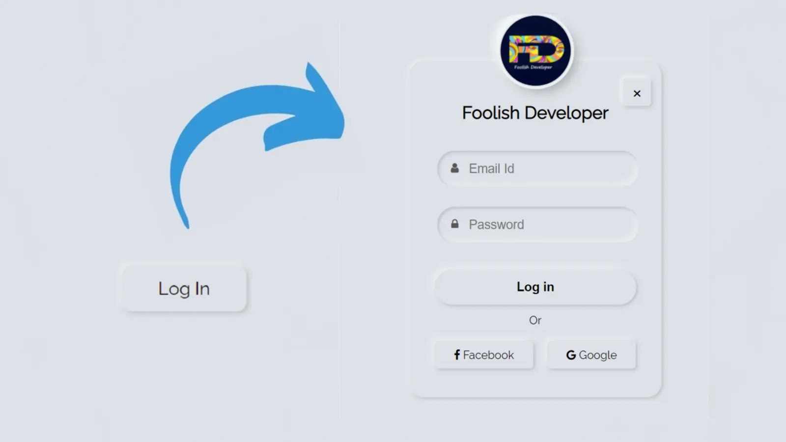
In this case, I did not use any bootstrap or jquery. Only HTML and CSS code are used and only a small amount of JavaScript code is used to make the pop-up work. In this case, the login form is not visible. When you click on the pop-up button, the login form will be visible.

 Like a normal login form, it contains everything including profile images, titles, email ID, password input space, login buttons, and links to social media platforms. You can see the demo below to know how the login form works. Hopefully in the demo above you have learned how this pop-up login form works.

See the Pen
pop neu
by Foolish Developer (@fghty)
on CodePen.

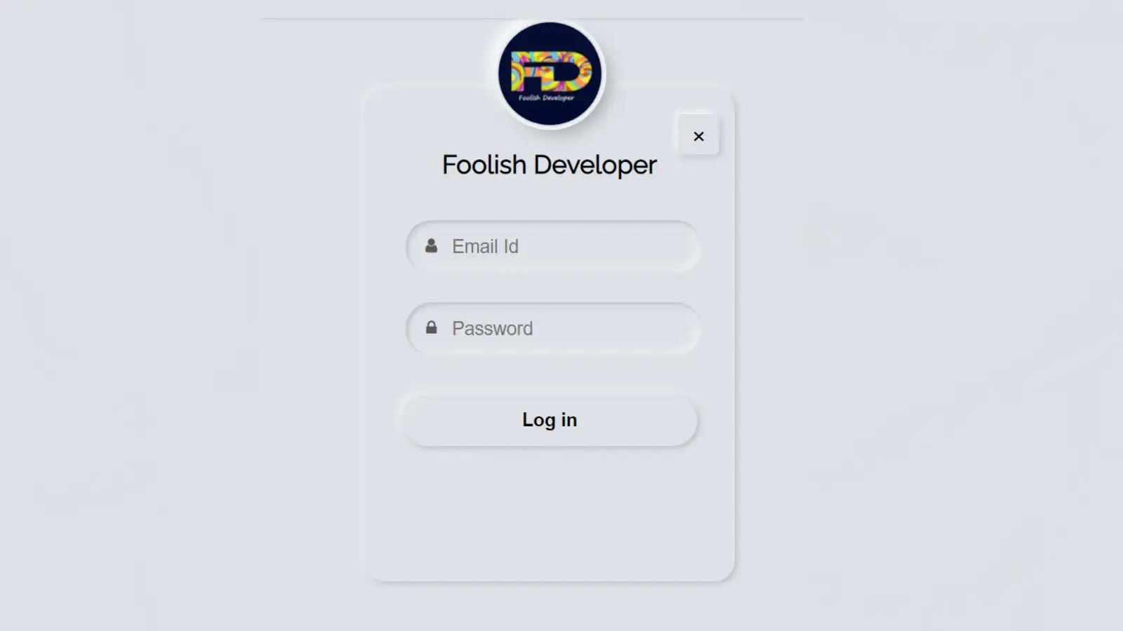
As you can see above, there is a button on the home page that, when clicked, shows the complete login form. I have added a profile image at the top of the login form and a title below it. There is a cancel button which when clicked will hide this pop-up login form again.

There is space to input email ID and password to log in. I added placeholders and icons to that input. Then I used a nice login button and used two social-media-icons below.

Step 1: Create the basic structure of this popup login form

 If you want to know how to make it, you must follow the tutorial below. In this case, I created an HTML file first in the meeting. In this case, I did not create any CSS file, but you can create a separate CSS file if you want. 

If you create a CSS file, be sure to attach that file to your HTML file. Copy the programming structure below and add it to your HTML file. 

<!DOCTYPE html>
<html>
<head>
    <link rel=”stylesheet” href=”https://cdnjs.cloudflare.com/ajax/libs/font-awesome/4.7.0/css/font-awesome.min.css”>
<meta name=”viewport” content=”width=device-width, initial-scale=1″>
<style>
 
</style>
</head>
<body>
 <div class=”popup” id=”popup-1″>
   <div class=”content”>
    <!–cancle button –>
    <!–Logo & Title –>
    <!–form content–>
   </div>
  </div>
  <!–Home page popup button –>
<script>
</script>
</body>
</html> 

The following code has helped to design the background of this login form and add the Neumorphism design to it. I have used the height of the login form 440px and width 300px, border-radius 20px to make the login form a bit round. Neumorphism I have used box-shadow to make the design work.

 @import url(‘https://fonts.googleapis.com/css2?family=Raleway:wght@400&display=swap’);
 body {
  background: #dde1e7;
  font-family: raleway;
  color: white;
  margin: 0;
}
.popup .content {
 position: absolute;
 z-index: 2;
 text-align: center;
 padding: 20px;
 border-radius: 20px;
 top: 50%;
 left: 50%;
 transform: translate(-50%,-150%) scale(0);
 width: 320px;
 height: 440px;
 box-shadow: -3px -3px 7px #ffffff73,
              2px 2px 5px rgba(94, 104, 121, 0.288);
 z-index: 1;
}
 .popup.active .content {
transition: all 300ms ease-in-out;
transform: translate(-50%,-50%) scale(1);
}

Step 2: Add a cancel button to the form

I first added a cancel button to this login form. Clicking on which will hide this pop-up box. Although this button will not work now, I just added the HTML CSS code below to design it. I need to add JavaScript code to make this work.

<div class=”close-btn” onclick=”togglePopup()”>×</div>
.popup .close-btn {
 color: rgb(0, 0, 0);
 font-size: 30px;
 border-radius: 10%;
 width: 30px;
 height: 30px;
 padding: 2px 5px 7px 5px;
 background: #dde1e7;
 position: absolute;
 right: 15px;
 top: 25px;
 box-shadow: -3px -3px 7px #fffdfdb7,
              2px 2px 5px rgba(94, 104, 121, 0.288);
 }
.popup .close-btn:hover,
button:focus{
  color: #3498db;
  box-shadow: inset 2px 2px 5px #babecc,
              inset -5px -5px 10px #ffffff73;
}

Step 3: Add profile images and text

First of all, I added the profile image and login title in this login form. I have used the following HTML and CSS code for this. You can use another profile image in place of this profile image if you wish. Image height 0px and width 100px have been used. 

In this case, margin-top 100 px has been used to place this profile image slightly above the login form. In this case, I have used box-shadow to make this profile image more beautiful and attractive. I have used text font size 25 px and the color white.

<img src=”https://lh3.googleusercontent.com/a-/AOh14Gj99VObFyE8W_h8RrcwZO_aYiIHu5AAa_XpnOym=s600-k-no-rp-mo”>
    <div class=”text”>Foolish Developer</div>
.content img{
  margin-top: -100px;
  border-radius: 50px;
  width: 100px;
  height: 100px;
  box-shadow: 
  0px 0px 2px #5f5f5f,
  0px 0px 0px 5px #ecf0f3,
  8px 8px 15px #a7aaaf,
  -8px -8px 15px #ffffff
  ;
}
.content .text{
  margin-bottom: 35px;
  margin-top: 20px;
  color: #000;
  font-size: 25px;
  font-weight: 600;
}

Step 4: Create a place to input email and passwords

The following HTML and CSS codes have been used to create input spaces. Below I have added plate holders and icons with each of those input spaces. Height 50px and width 90% of input space used. I have used Neumorphism design in the input space but in this case, these spaces are slightly inward.

  <form action=”#”>
      <div class=”field”>
        <span class=”fa fa-user”></span>
        <input type=”text” placeholder=”Email Id” required>
        
      </div>
      <div class=”field”>
        <span class=”fa fa-lock”></span>
        <input type=”password” placeholder=”Password”>
       
      </div>
      
    <!–Login button –>
    <!–social button –>
    </form>
.content .field{
  display: flex;
  padding: 5px 20px;
  height: 50px;
  width: 90%;
  position: relative;
}
.field input{
  outline: none;
  border: none;
  color: #595959;
  background: #dde1e7;
  border-radius: 25px;
  height: 100%;
  width: 100%;
  padding-left: 45px;
  font-size: 18px;
  box-shadow: inset 2px 2px 5px #babecc,
              inset -5px -5px 10px #ffffff73;
}
.field:nth-child(2){
  margin-top: 20px;
}
.field span{
  line-height: 50px;
  color: #595959;
  position: absolute;
  width: 50px;
}
.field input::placeholder{
     margin-left: 10px;
}

Step 5: Create a login button

I have created a nice login button in this login form for which the following HTML and CSS code have helped. The height of the button is 50 px and the background is white.

 <button>Log in</button>
button{
  margin: 35px 0 0 0;
  width: 90%;
  background: #dde1e7;
  border: none;
  outline: none;
  cursor: pointer;
  height: 50px;
  color: #000;
  font-size: 18px;
  padding: 5px 20px;
  font-weight: 600;
  border-radius: 25px;
  box-shadow: 2px 2px 5px #babecc,
              -5px -5px 10px #ffffff73;
}

Step 6: Add social media button

At the end of it all, I added two social media buttons. Basically, I have used Facebook and Google in this case, you can make any other button if you want.

<div class=”or”>Or</div>
      <div class=”icon-button”> 
          
    <span class=”facebook”><i class=”fa fa-facebook”></i>  Facebook</span>
     <span><i class=”fa fa-google”></i>  Google</span>
 </div>
.content .or{
  color: black;
  margin-top: 13px;
}
 
.icon-button{
  margin-top: 25px;
}
.icon-button span{
  color: #000;
  border-radius: 5px;
  line-height: 30px;
  padding-left: 27px;
  padding-right: 27px;
  padding-top: 10px;
  padding-bottom: 10px;
  background: #dde1e7;
  box-shadow: 2px 2px 5px #babecc,
              -5px -5px 10px #ffffff73;
}
.icon-button span.facebook{
  margin-right: 17px;
}
.icon-button span:hover{
  color: #3498db;
  box-shadow: inset 2px 2px 5px #babecc,
              inset -5px -5px 10px #ffffff73;
}

Step 7: Create the popup button on the home page

There is a nice button on the homepage which can be clicked to view the login form. I have also added a Neumorphism design in the buttons on the homepage.

<div onclick=”togglePopup()” class=”first-button”>Log In</div>
.first-button {
color: rgb(0, 0, 0);
font-size: 20px;
font-weight: 500;
transform: translate(-50%, -50%);
background: #dde1e7;
box-shadow: -3px -3px 7px #ffffff73,
              2px 2px 5px rgba(94, 104, 121, 0.288); 
transition: box-shadow .35s ease !important;
padding: 13px 40px;
position: absolute;
top: 50%;
left: 40%;
border-radius: 10px;
border: none;
outline: none;
}

Step 8: Activate the popup button using JavaScript code

function togglePopup() {
 document.getElementById(“popup-1”)
  .classList.toggle(“active”);
}

We hope you enjoy the design of this pop-up login form and that you have learned from this article how I created this design. If you have any difficulty in making this design, you can definitely let me know in the comments. You can see many more such designs that I have already made. Please comment on how you like this design.