
Learn how to make a flip card using Html and CSS code. Flip Card is a great UI design that you can create with the help of basic Html and CSS. The flip card basically helps to add a lot of information to a card. You can add some information on the front and back of this card.
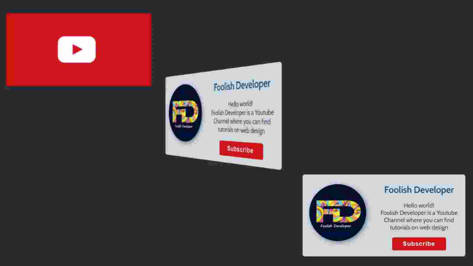
As a result, this type of flip card is used to add a lot of information in one place. When you click on this card or move the mouse, the backside of this card will appear in front. The structure I have created in this article is basically a subscribe box and in this case, information related to a YouTube channel has been added. Under normal circumstances, I used the background red color on the front of this card and a youtube logo image.
The back of this design can be seen when you hover the mouse over the card. On the backside, I added the profile image, name, some information about that youtube channel. I have added a subscribe button with all this information. Clicking on it will subscribe to the channel.
See the Pen
Flip subscribe Card by Foolish Developer (@fghty)
on CodePen.
In the following tutorial, I have shared complete information for making this design. I have shared with you the method of making this flip card with all the information step by step. I hope you can learn how to make a flip card by following the tutorial below.
Step 1: Create the basic structure of the card
First of all, I have used the basic HTML structure below which has been used to create the front and back sites of the card.
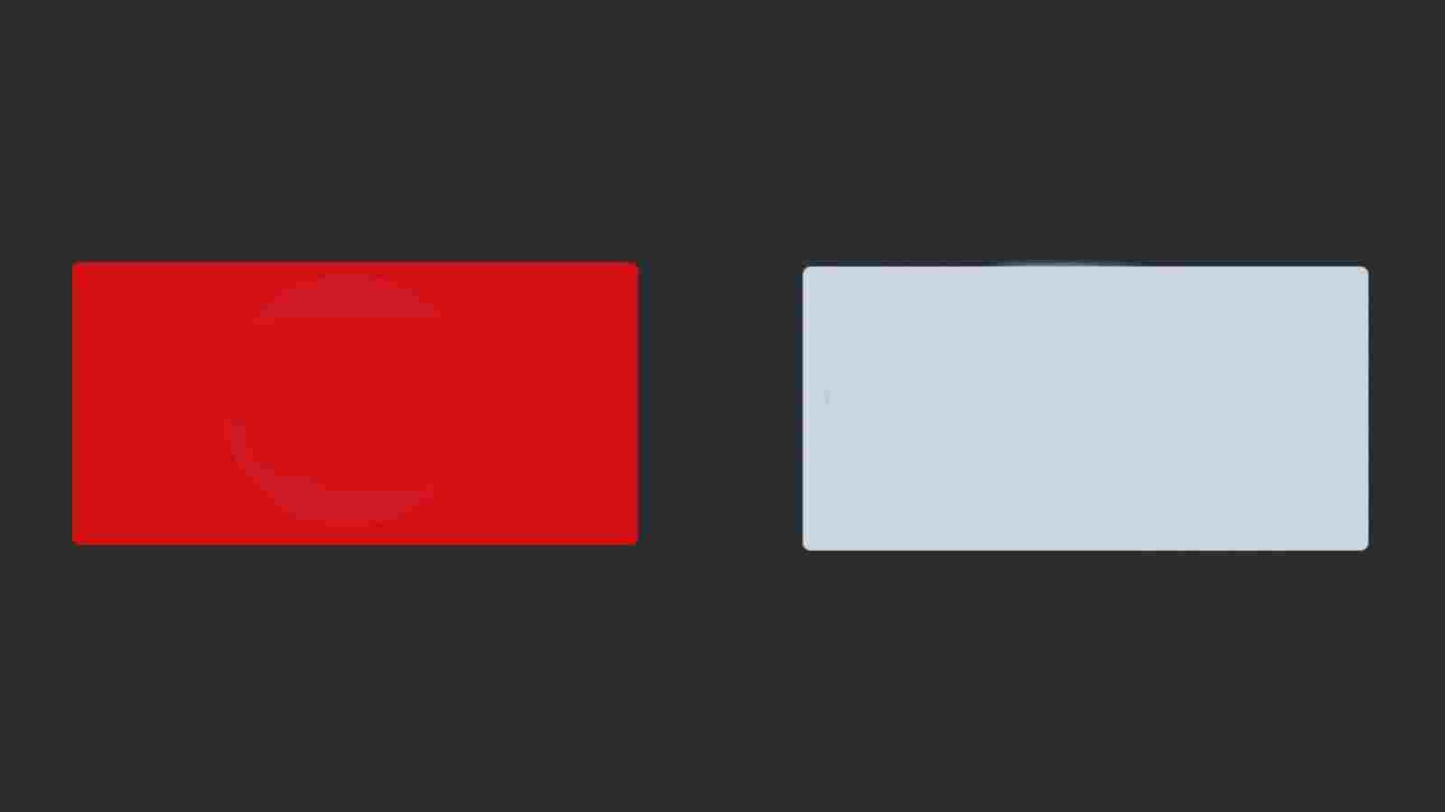
The CSS code below has helped to design the front and backside of this card and add a variety of colors. On the front I used red and on the back I used white. Height: 13px and width: 26px have been used for this card.
<!DOCTYPE html>
<html lang=”en”>
<head>
<meta charset=”UTF-8″>
<meta http-equiv=”X-UA-Compatible” content=”IE=edge”>
<meta name=”viewport” content=”width=device-width, initial-scale=1.0″>
<title>Document</title>
<style>
</style>
</head>
<body>
<div class=”card-wrap”>
<div class=”card”>
<div class=”card-front”>
<!– Card Fonts –>
</div>
<div class=”card-back”>
<!– card Back –>
</div>
</div>
</div>
</body>
</html>
@import url(‘https://fonts.googleapis.com/css2?family=Cabin:wght@400;500;600;700&display=swap’);
*{
box-sizing: border-box;
margin: 0;
padding: 0;
}
html{
height: 100vh;
justify-content: center;
font-family: ‘Cabin’, sans-serif;
background-image: linear-gradient(60deg, #66757F, #292F33);
display: flex;
align-items: center;
}
.card-wrap{
border-radius: 0.37rem;
perspective: 1000px;
height: 13.65rem; /* Card Height */
width: 27.15rem; /* card width */
}
.card{
height: inherit;
width: inherit;
position: relative;
transition: transform 1s;
transform-style: preserve-3d;
}
.card-front,.card-back{
width: inherit;
backface-visibility: hidden;
position: absolute;
height: inherit;
border-radius: 0.37rem;
}
.card-front{
background-color: #d30404; / * Card front background color */
display: flex;
align-items: center;
justify-content: center;
}
.card-back{
background-color: #CCD6DD;
transform: rotateY(180deg);
}
The hover effect is used in the card as I said before. When you click on this card you will see the back of this card. For this, I have used a small amount of CSS code below which means that when you click on the top of the card the card will rotate at a 180-degree angle.
.card-wrap:hover .card{
transform: rotateY(180deg);
}
Step 2: Add an image to the front of the card
First of all, we have added the profile image on the front of this card i.e. YouTube logo with the help of our own HTML and CSS code.
<div class=”card-logo”>
<img src=”https://i.pinimg.com/originals/19/7b/36/197b365922d1ea3aa1a932ff9bbda4a6.png”/>
</div>
.card-logo img{
width: 290px;
}

Step 3: Add a profile image to the back of the card
Again we will design the back of this card i.e. we will add all the information on the back. As I said before I added a profile image and some information on the back. The following HTML and CSS code helped to create and design the profile image.
Box-shadow has been used to make this profile image more interesting. I have used a border radius of 50% in this case. The following HTML code helps to make the various information on the card and the subscribe button on the card to make this image completely round.
<div class=”user”>
<img src=”https://lh3.googleusercontent.com/a-/AOh14Gj99VObFyE8W_h8RrcwZO_aYiIHu5AAa_XpnOym=s600-k-no-rp-mo” alt=”user-profile-picture”>
</div>
.card-back .user img{
width: 35%;
float: left;
border-radius: 50%;
margin: 1.6rem 1.1rem;
box-shadow: 3px 3px 10px #66757F;
}

Step 4: Add profile information and buttons
We will use its CSS code to design the information and subscribe button added above. For the background of the button, I used the color: white. Added a hover to change the background color when you click on it.
<div class=”user-info”>
<div class=”username”>Foolish Developer</div>
<div class=”user-bio”>
<p>Hello world!<br>
Foolish Developer is a Youtube Channel where you can find tutorials on web design<br>
</div>
<button class=”follow-btn” onclick=”window.location.href=’https:#'”>Subscribe</button>
</div>
.user-info{
height: inherit;
display: flex;
flex-direction: column;
text-align: center;
color: #292F33;
padding: 1.6rem 1.1rem;
}
.user-info .username{
font-size: 1.5rem; / * Card back-side name font size */
font-weight: 600;
color: rgb(2, 68, 99); /* Text color */
}
.user-info .user-bio{
font-size: 1rem;
margin: 1.1rem 0;
}
.follow-btn{
padding: 0.5rem;
width: 9rem; /* Button Size */
color: #E1E8ED;
background-color: #ce0505; /* button background color */
border: 0;
font-weight: bold;
font-size: 1rem;
letter-spacing: 0.0625rem;
border-radius: 0.27rem;
margin: 0 auto;
}
.follow-btn:hover{
cursor: pointer;
background-color: #ff0d41; /* Button hover color */
color: white;
}

I hope you have learned from this tutorial how I created this 3D flip card using HTML and CSS programming code.