
Animated Skills Bar HTML CSS is used in various personal and education websites. Skill Bar lets you decorate your Experience webpage.
Hello in this article I have shown you how to create Animated Skills Bar using only HTML and CSS code. Earlier I designed many more types of progress bars. I did not use any JavaScript or JQuery in this design. I have designed this skills bar using only HTML and css3.
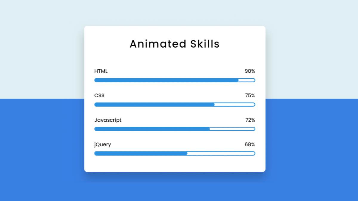
Here I have made four bars and used animation in each of them. When you load this page, it will reach the value you set from 0. Here I have used blue color. You can use a different color for each if you want.
Animated Skills Bar HTML CSS
I used a shadow around the box so that the box could be seen more clearly. I first used a title in that box and four times below it. Here is a title and a percentage for each progress bar.
You can watch the live demo below to get a live experience of how the design works. Of course, here you will get the complete source code for making this design.
Hopefully, both the video above and the live demo has helped you to learn how to build this Skills Bar completely beautifully.
How to Make Animated Skill bar using HTML & CSS
Below I have explained in full step by step how I made this Animated Skills Bar. To create this design you need to create an HTML and CSS file. Then you continue to use the codes the way I used the codes below.
After using each code, I have given possible results with pictures so that you can understand.
Step 1: Design the web page
First I designed the basics of web pages using some basic CSS code. In this case, I have used the background color # 0a7aca on that page.

Step 2: Make a box on the webpage
I have created a small box on this web page using the following HTML and CSS code. As I said before, all the Skills Bars are kept in one box.
I used a shadow around this box which helped me to understand what it is in a brighter way. Also, border-radius: 10px has been used to make some of the four rounds.

Step 3: Add a title
I created a title in this box using the HTML and CSS code below. I used text-align: center to keep it in the center and font-size: 33px to increase the size a bit.

Step 4: Add information to the Skills bar
Now I add the necessary details to create this Animated Skills Bar with the help of HTML code. At first, I only added information for a progress bar and showed its possible results. Then I added the complete information of three more skill bars.


Step 5: Design the skills bar using CSS code
I have designed the HTML codes added above with the CSS code below. As you can see in the demo, there is a border around the progress bars. I used border: 2px solid # 0d96e0 to make this border.
I used the background color # 0d96e0 of the animation bar here and I used height: 9px to increase it. Border-radius: 10px is used to make the two edges slightly rounded.
Using the CSS code below, I created a gap between each CSS skills bar.

Step 6: Activate the animation with keyframes
Now is the time to add animation in this Simple Skills bar. Above I used my width: 0 which means this animation could not be seen under normal conditions. Here we have used @keyframes for HTML width: 90%. That means it will reach 0 to 90% through animation.

I have added three more animations below, like the animation of the bar by adding the above. In this case, also I have added specific values using width. You can change its value if you want. In this case, I have used 2 seconds for animation. If you want it to be animated faster then you can use 1 second.

Hopefully from the above tutorial, you have learned how to make Animated Skills Bar HTML CSS. I have already made many more types of progress bars. If you like this design then you can see other designs.
You can take the help of the video tutorial above to know more complete step by step. If there is any problem, you can let me know by commenting.