A circular progress bar is a project, for tracking progress that utilizes JavaScript functions to check the progress of elements. Then with the help of HTML and CSS properties to represent this tracked progress in a circular range displaying the elements progress. This kind of project is commonly utilized on websites where users need to monitor data progression.
In this tutorial we’ll guide you through the process of building a straightforward progress bar using HTML, CSS and Javascript. This project is particularly beneficial, for those who’re new, to web development and want to pursue a career in this field. Throughout the tutorial we’ll explore JavaScript concepts that’re essential for creating an engaging animated circular progress bar.

JavaScript Circular Progress bar is used on various websites to show education and experience. I made this circle progress bar with the help of HTML CSS and javascript. In the meantime, I have designed another Progress Bar with the help of Bootstrap.
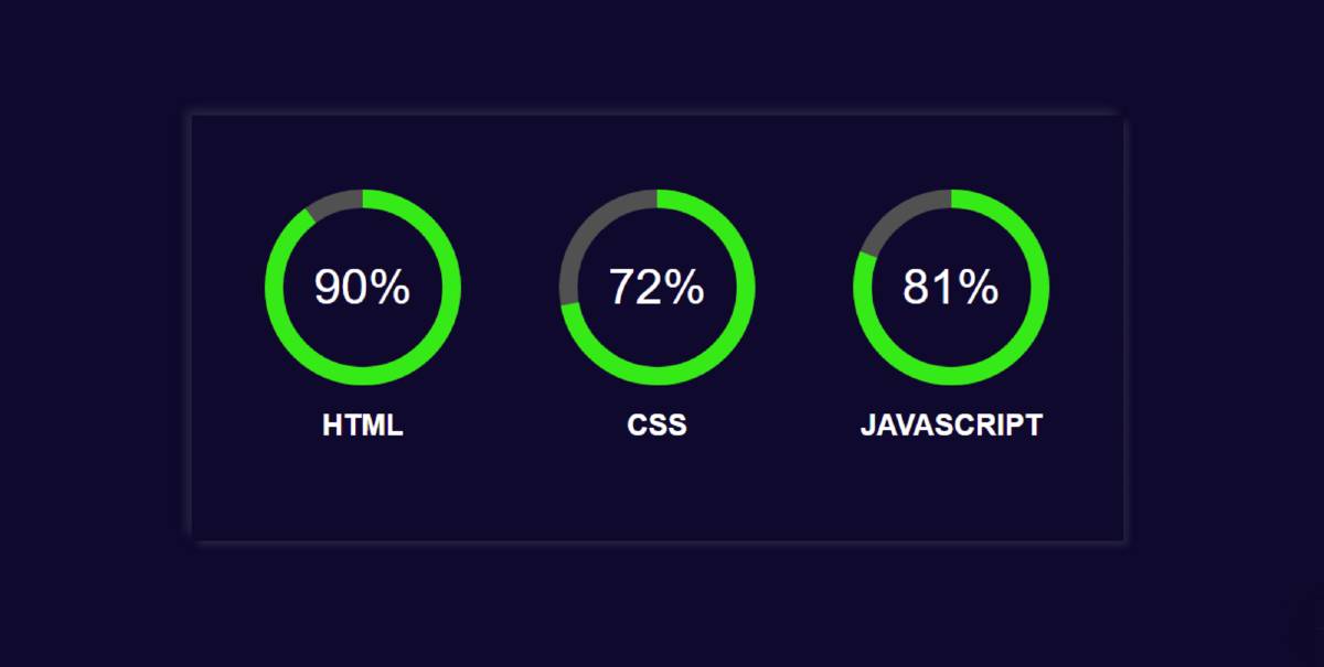
This design is made much simpler and fully responsive. Here I made three bars. The first is for displaying HTML, the second for CSS, and the third for JavaScript percentages.
First of all, I have given the background color of web page # 0d0c2d. Then I made a box on that web page. I have kept the color of the box and the background color of the webpage the same.
In this case, we have used a shadow in the box which indicates the size of this box. It has three Circular Progress Bars and each has a percentage and a text. I used color # 36e617 to show progress here. You can use any color you want here.

JavaScript Circular Progress Bar (Live Demo)
Adding the Structure: (HTML)
We will be creating our circular progress bar in a step-by-step format, We will be starting with the basics of HTML adding some important link for example, adding the css link inside the header section so that we can use a different file of css for styling our circular progress bar.
  <script src="https://cdnjs.cloudflare.com/ajax/libs/jquery/3.3.1/jquery.min.js" charset="utf-8"></script>
  <script src="https://cdnjs.cloudflare.com/ajax/libs/easy-pie-chart/2.1.6/jquery.easypiechart.min.js" charset="utf-8"></script>
  <meta charset="UTF-8">
  <meta name="viewport" content="width=device-width, initial-scale=1.0">
  <meta http-equiv="X-UA-Compatible" content="ie=edge">
  <title>Login Form</title>
  <link rel="stylesheet" href="css.css">
 <style>
Step 1: Design the progress bar’s background
First of all we have designed the background of our progress bar using the div tag we will create a container for our progress bar and for styling this container we have used a class called “container”.
<div class="container">


</div>
The body tag selector helps add styling to the body of the webpage. We will set the padding and margin of the webpage to “zero.” Also, using the height property, we will set the height of the webpage body to 100 vh, and using the font-family property, we will set the font to “sans serif.”.
Now using the class selector property “container,” we will add the styling to our container. We will set the background of the container to “dark blue” and use the display type as a grid so that we can create different progress bars in the columns, and using the box shadow property, we will set the box shadow to white around the box.
body {
  margin: 0;
  padding: 0;
  justify-content: center;
  height: 100vh;
  color:white;
  background: #0d0c2d;
  font-family: sans-serif;
  display: flex;
}

.container {
  background: #0d0c2d;
  padding: 60px;
  display: grid;
  grid-template-columns: repeat(1, 160px);
  grid-gap: 80px;
  margin: auto 0;
  box-shadow: -5px -5px 8px rgba(94, 104, 121, 0.288),
              4px 4px 6px rgba(94, 104, 121, 0.288);
}
Step 2: Add basic information with HTML code
Now I have added all the elements of this javascript circular progress bar using HTML code. Here data-percent = “” is used to determine the value of your circle progress bar. I have 90% for HTML, 72% for CSS and 81% for JavaScript. If you want to change, you can change the values here.
With this, I have used a text that will help to know which bar is for which work. Now I have executed this Circular Progress Bar using the jQuery code. In order to execute the jquery code, I have first added the jquery CDN link.

Step 3: Activate the progress bar using jquery
➤ First I used size: 160 which will determine the size of this circle.
➤ barColor: “# 36e617” I used which will determine this progressive color. Here I have used green. You can use any other color if you want.
➤ lineWidth: 15 basically helps to determine the size of the color line in this bar.
➤ trackColor: “# 525151” is here mainly for the background of the circular.
➤ I have used animate: 2000, which means it will take 2000 milliseconds (2 seconds) for the animation to take place. As a result, when you open the page, it will take you two seconds to reach the mean you set from zero.

Step 4: Design the title
I designed the titles using the following CSS codes.

Step 5: Design percentage text
I designed and positioned the percentage I used here using the CSS codes below. If you have seen the demo, you will understand that the text here is placed in the middle of the progress bar.
Used text-align: center and position: relative for this. I used font-size: 40px and the color white to make the text sizes a little bigger.

Step 6: Determine the position of the circle
I have specified the position of this circular progress bar using the following codes. For this, I have used position: absolute and left and top zero.

Step 7: Make it responsive with CSS
Now, this design is ready to use in any of your websites or project. However, I have made it responsive for all devices using some CSS code below. I have used CSS’s @media for this. Then I have determined how it will look for any screen size.
Conclusion
Hopefully from this tutorial, you have learned step by step how I have created this circular progress bar using HTML CSS and javaScript.
In the meantime, I have created many more types of web elements and designs on this blog site. You can see those designs if you want.
Below I have given the download link of the source code required for this circle progress bar. You can download those codes if you want.
Final Video Output: