
Neumorphism Login Form is much more interesting than other login designs. CSS Neumorphism Login Form You can easily create with HTML and CSS. In this article, I am going to show you how to create a Neumorphism login form using only HTML and CSS code. Earlier I made login form in many more designs.
We all know that the login form is a very important element of a website. This type of login form is used to access accounts on various websites. There are different types of login forms that I have already created. Neumorphism is a very important UI trend. This design is much simpler and much more interesting to look at than the general design.
Neumorphism All these elements are made by a single color in the case of login design. In this case, the element and the background of the web page are completely the same. The size of the element is determined here using only the shadow of the CSS code.
Video Tutorial of Neumorphism Login Form
You can watch the video below to know the complete tutorial on how I made this CSS Neumorphism login page.
Hopefully, you have learned how to make it from the video tutorial above. Everything here is like a normal login form.
In the case of Neumorphism design, the background color of the webpage and the background color of the element is the same. In that case, the shape of the element is created using the shadow (box-shadow) of CSS.
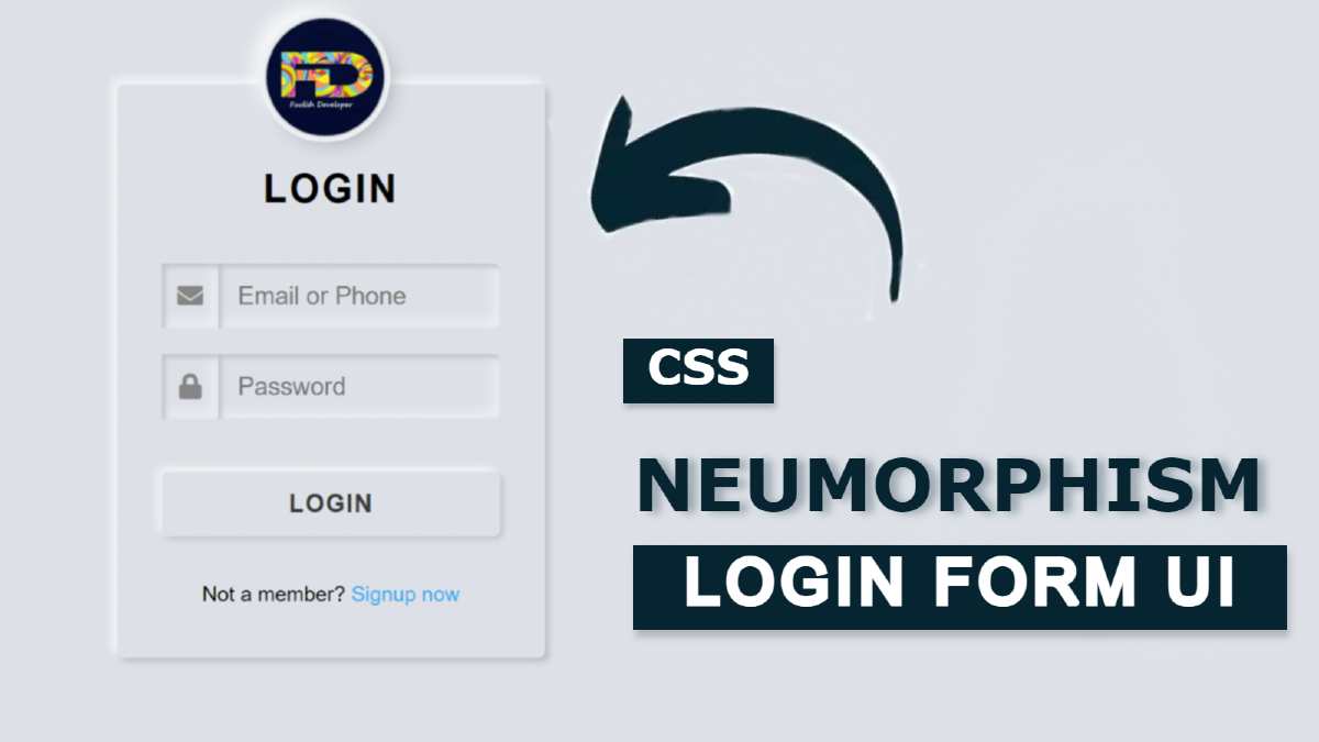
First of all, I used a profile image. This image is slightly above the login form, meaning that half of the image is inside the Neomorphism Login Form Design and the other half is outside the login form. Which looks much more interesting and beautiful to look at. Below that, I used a title. I used email ID and password input space to log in. I have used one icon for each input. Then there is a login button.
Normally the button rises slightly upwards. When you click on it, the button will move slightly inwards. I have used some text below everyone. All in all, it is a very simple CSS Neumorphism login form design.
Below I have given a live demo that will help you know how it works. Below you will find the required source code which you can copy and use for any of your own purposes. Also at the bottom of the article, I have given the download button to download the source code. But if you are a beginner then you must follow the tutorial below.
See the Pen
Neumorphism login form 3 by Foolish Developer (@fghty)
on CodePen.
Neumorphism Login Form using HTML & CSS
Now is the time to know which code I have used for any purpose. To use the source code, first create an HTML and CSS file. Then attach that CSS file to the HTML file. Paste the above HTML codes into the HTML file and paste the CSS codes into the CSS file.
Step 1: Create the basic structure of the login form
First I designed the background of this login form. Here I made a Neumorphism design box. I have used the background-color # dde1e7 of the webpage and the minimum height is 100vh. I used the width of the box: 330 px and min-height: 100px.
In this case, I have used box-shadow here to understand something more clearly from the webpage of the box. As I said earlier in the case of Neumorphism design the background color of the web page and the element are the same.
In this case, the elements are identified using only the shadow of the CSS code. Here margin-top and margin-left are used to place this box in the middle of the webpage.

Step 2: Add a profile image
Now I will add a profile image. For which I added the image using everyone’s first HTML and designed that image using CSS code. In this case, I have used the height and width of the image 90 px.
Margin-top: -100px has been used to place something above the login form. Border-radius: 50px is used to make round. Also here is a border and shadow is used around the image for which I have used box-shadow. Margin-left: 31% has been used to place this profile image in the middle of the login form.

Step 3: Add titles to the form
Now I have used a title. As you can see in the demo, a title is used below the profile image. I have used font-size: 30px of that title, text-align: center has been used to keep it in the middle.

Step 4: Create Email Password Input Place
Now I will create a place to input the email ID and password to log in using the input function of HTML. Here I have used the font awesome icon. So of course when you add a font awesome CDN link to your HTML file.
Using input I have created a place to input email IDs and passwords here. In each case, we have used a placeholder that will help us understand what to input in a box.

Step 5: Design the input using CSS code
Now using CSS I will design those input places. I have used the height of the icon used in this case: 50px and the width: 60px. I used font-size: 20px to make the icons a bit bigger. The input space here is line-height: 50px and width 100%.
In this case outline: none and border: none have been made so that there is no border. In this case, you will see that the input space is slightly inward. I have used the box-shadow inset for this.

Step 6: Create a login button to login
Now I will create a login button. For this, I have used the following HTML and CSS codes. First I created a button using HTML’s button function.
Then I designed it by CSS code. The hove effect has been used on the button. When you click on that login button, the login button will move slightly inwards and the color will change.

Step 7: Add extra links
At the end of it all, I used some text and used a link. Text-align: center is used to place this link and text in the middle. Text-decoration: none has been used so that there is no underline below the link.

Hopefully, in this tutorial, I have explained to you how I created this CSS Neumorphism login form design. If you want to know more about how it is made, you can watch the video tutorial above.
Earlier using Neumorphism design I have created many types of elements like login form, sidebar menu, navigation menu, calculator, etc. If there is any problem or the download button below does not work, you can let me know by commenting.