In this article, you will learn how to create Custom Toggle Switch using HTML and CSS. Toggle Switch is a type of radio button with some animation and color effects. This makes it look much more attractive and beautiful than the normal radio button.

To create the CSS Custom Toggle Switch, I first created a radio button using the HTML checkbox (<input type=”checkbox”>). Then I designed it with the help of CSS. This type of design is used in various places such as the dark and light mode buttons of the website, to enable some options, as well as to choose any one of the many options.
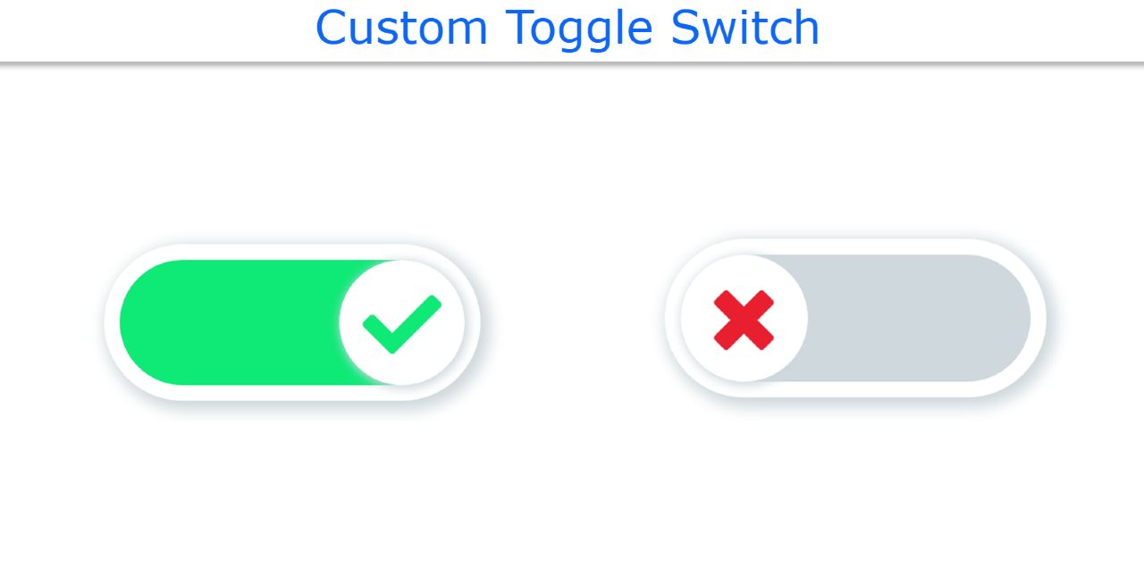
Custom Toggle Switch using HTML and CSS
To create this project (Custom Toggle Switch Buttons) I first created a radio button using HTML input. I have given the input space in the form of a slider with the help of CSS. Then I made a small round button in that slider. The button is usually on the left. Whenever that button is clicked, the button will move to the right. Below is a live demo that will help you learn how it works.
See the Pen
How to create a custom Toggle Switch by Foolish Developer (@fghty)
on CodePen.
All you have to do is have an idea about basic HTML and CSS. I have explained the method of making each element in a beautiful way.
Step 1: Design the background
I designed the webpage to create a Toggle Switch using HTML and CSS code. Here I have used some CSS code like height: 100vh of webpage and align-items: center to place all content in the middle of the webpage.
Step 2: Create the basic structure of Toggle Switch
Now I have created the basic structure of this custom switch using the following HTML and CSS code. Then I used height: 10em and width: 24em to make it the size of a slider. I have kept the background color white so I have used box-shadow to determine the size here. Border-radius: 10em helped to make the slider round.

Step 3: Create a radio button using the checkbox
Now I have created a custom radio button using the HTML checkbox. A checkbox is a type of input function. I get a lot of input from HTML such as text, password, buttons, files, etc. Exactly the same checkbox (<input type = “checkbox”>) is a type of input function.
Here we have used input’s display: none, which means that under normal circumstances we will not see the checkbox.

Step 4: Create a Custom Toggle Switch in the slider
Now I have made a switch in the slider. I used the level of HTML to create the switch. Then I converted that level into a switch with the help of CSS code. I used border radius to make the Custom Toggle Switch round. The box-shadow helped to make it more attractive.

Step 5: Activate the toggle button with CSS
I have implemented this Toggle Switch using the following codes. As I said before the button is usually to the left of the slider. Whenever you click on this switch, it will move to the right of the slide.
If you have seen the demo above, you will understand that a kind of animation has been used here. When you click on that button, the button will move 14em along the x-axis. And rotate once along the z-axis.
I have also been instructed to change the background color of the switch. You can see the gray color in this background under normal conditions. When you activate the Toggle button, the background color will turn green.

Step 6: Add a cross mark to Switch using:: before
Now is the time to take the help of CSS before and after to add different types of symbols to this project (Toggle Switch with HTML & CSS ). ‘Before’ helps what will change before an element and ‘After’ helps what will change after that element.
First, I used Before to determine which of these switches would normally be visible. I used content: “f00d” to show this sign. Here font-size: 5em is used to keep the size of the symbol slightly larger and the color red is used.
Below all I gave opacity: 0 using: checked. This means that the icon will no longer be visible when this button is clicked.

Step 7: Add a second symbol to the CSS Toggle Switch
Now we will add the second sign. The second sign was originally added using After Effects. I used content: “f00c” to add the symbol here. Here I have used Optical Zero which means this sign cannot be seen in normal conditions (when the switch is off).
At the end of it all, I used opacity: 1 using: checked. This means that the icon will be visible only when this button is activated.

Hopefully, you have learned from the tutorial how I created this project. Along with this, I have shared many more types of HTML and CSS tutorials so you can see the designs.
If you like the article, be sure to share it with your friends. If there is any problem then, of course, you can ask me by commenting. You can also ask any question directly on Instagram(@foolishdeveloper).