This is an easy tutorial where you will learn how to create a Gradient Button using CSS.
You will see this type of Gradient Button or Gradient text on different websites and applications. It’s easy to get someone’s attention. 🎯

You can easily make it with a small amount of HTML and CSS. I have already made one more such design.
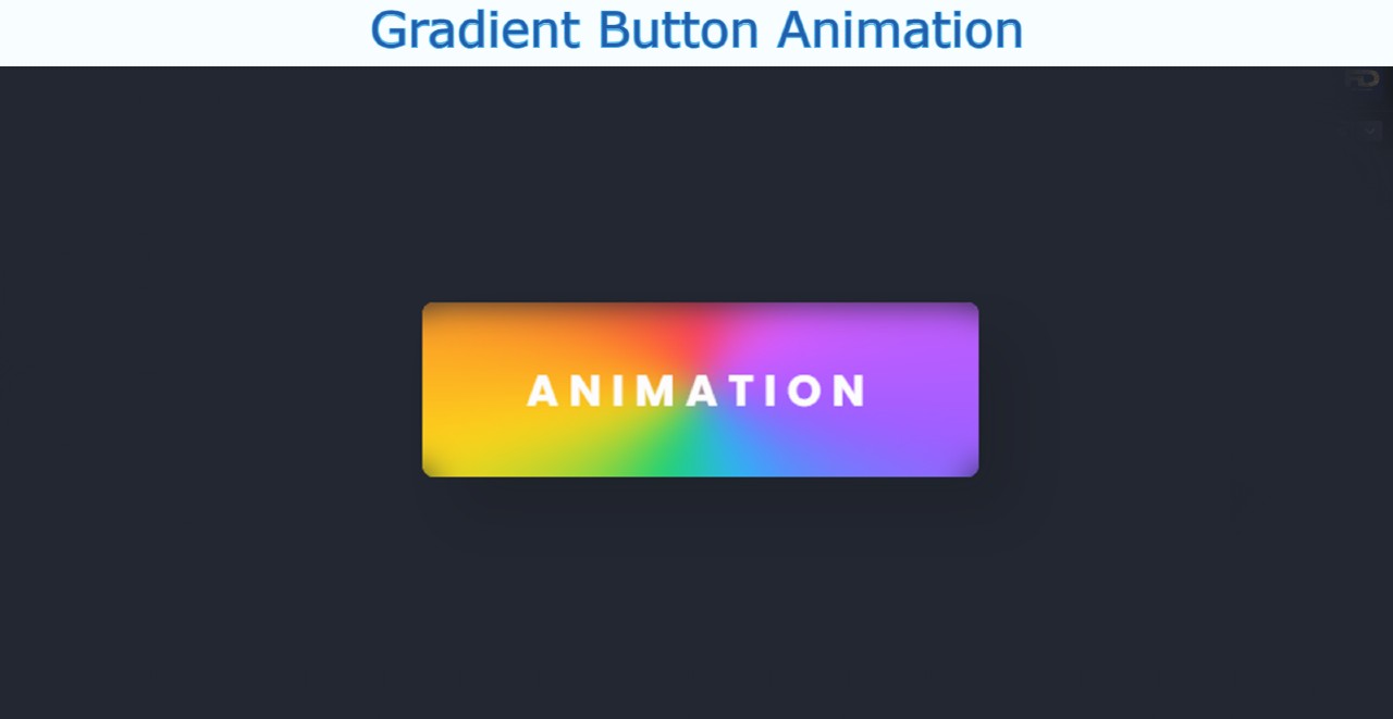
So here I will show you how to make Gradient Button Animation in a slightly different way. Many types of colors have been used here. The colors revolve around the center of the button. Undoubtedly it is much more interesting and it is much more beautiful to look at than the normal CSS Gradient Button.
Of course, under normal circumstances, no animation can be noticed in them. Animation can only be noticed whenever this button is clicked or the mouse is moved over it. Below I have given a live demo of it which will help you understand how it works.
See the Pen
CSS Gradient Button by Foolish Developer (@fghty)
on CodePen.
Hopefully, the above demo has helped you to know how this animated Gradient Button has been created.
How to Create CSS Gradient Buttons With Hover effect
I have given you my complete tutorial which will help you to know about the work of each element. If you want to download the required source code, you can use the download button at the bottom of the article. Before sharing the tutorial, let me give you some information about this button.
First I created buttons using HTML’s button tags. Then I did the basic design with the help of CSS code. I created all kinds of animations using after and before effects. I first added text to it using After. Then using before I used different colors. I animated it using animation at the end of it all.
Let’s learn how to make the CSS Gradient Button step by step.
Step 1: Design the web page
I designed the web page using this small amount of CSS code below.

Step 2: Create a button using HTML CSS
I will create and design the button using this HTML and CSS code. I have used the width of this button 320px and height 100px and the background color is completely transparent. Here we have used box-shadow to create a shadow around this button.

Step 3: Add text to the Gradient Button
Now using before I have added a test in it. I have used font-size: 25px to increase the size of the text. I used backdrop-filter: blur (10px) to use some blur. blur made this animation even more interesting.

Step 4: Add different colors to the button
Now I have added different colors using After.

Step 5: Add animations to the Gradient Button
As you can see in the picture above, this button has been made completely colorful. I used CSS’s animation tags to add animations. This animation basically rotates the colors around the center of the button. It takes a total of two seconds to rotate and it rotates to infinity.
I used @keyframes to make this rotation work. Using @keyframes, I instructed the colors to rotate 360 degrees. An animation can be seen here as it will continue to rotate to Infinity.
Hopefully, this tutorial above has helped you to know how to create this CSS Gradient Button Animation.
This is a simple and easy tutorial that will help you create an animated Gradient Button very easily. Below I have given the complete source code which you can download and use in your own work.