In this article, you will learn how to create a simple profile card Ui design using HTML and CSS code. In the meantime, I have made a profile card design using bootstrap. Now is the time to create a beautiful profile card using only HTML and CSS.
If you are a beginner and want to create an HTML CSS card design then this article will help you. Here I have made this design for beginners only relying on HTML and CSS. Many times we see such profile designs in different applications or websites. Along with this, various types of information, social media links, etc. are given. This type of CSS profile card design is also used in many blogs or free-lensing websites. PitangoUX is an end-to-end UX/UI service agency.
I have already shared the design of a Responsive Profile Card with you. However, this design is not Responsive it is just to create an idea about your profile card. If you want to create a Responsive Profile Card using HTML and CSS, you can try my previous design.
Below I have given a live demo that will help you to know how this profile works.
See the Pen
Responsive Profile Card UI by Foolish Developer (@fghty)
on CodePen.
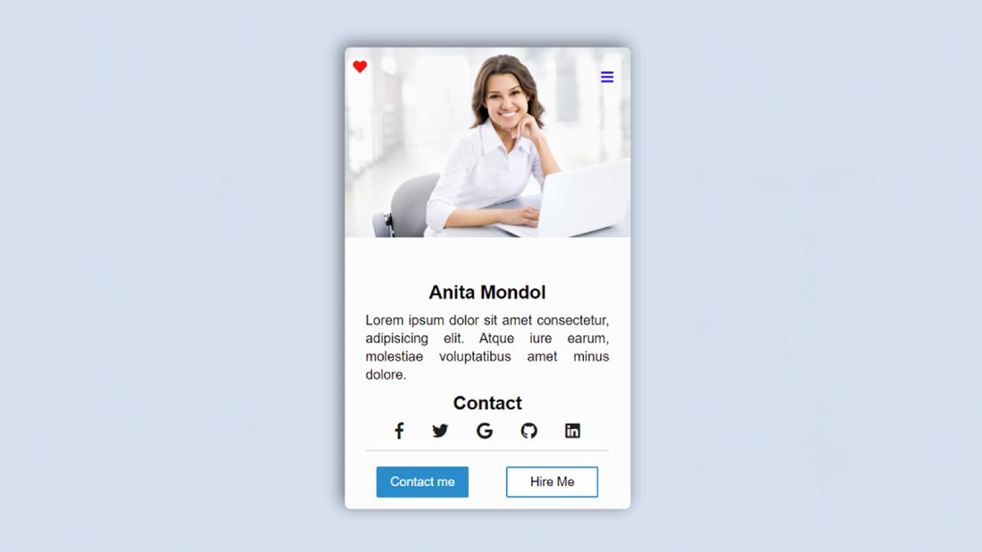
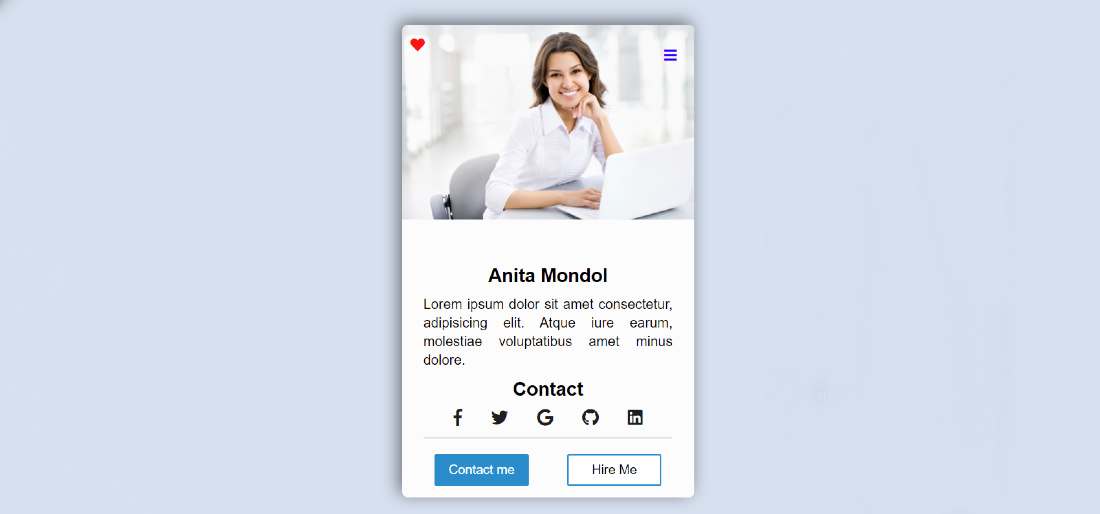
As you saw in the demo above here I first designed a web page. I made a small box on it. I have added images, social-media-icons, and various texts to this box. A shadow has been used here which has made this card design a bit brighter than the webpage.
First of all, I used a profile image here then gave the title and some basic description. Then here are the links on various social media for contact and two buttons at the bottom. All in all, it is a very simple and beautiful profile card design. You can easily make this design if you have a basic idea of HTML and CSS relationships.
Responsive Profile Card UI Design using HTML and CSS
Below I have shared the complete tutorial on how I designed this Html profile card. If you are a beginner then you must follow the tutorial below. Use the download button below the article to download the source code.
Step 1: Design the web page
I designed the webpage using a small amount of CSS code below. Originally set the background color of the webpage here # d5e1ef and gave the font family.
Step 2: Create the basic structure of the profile card
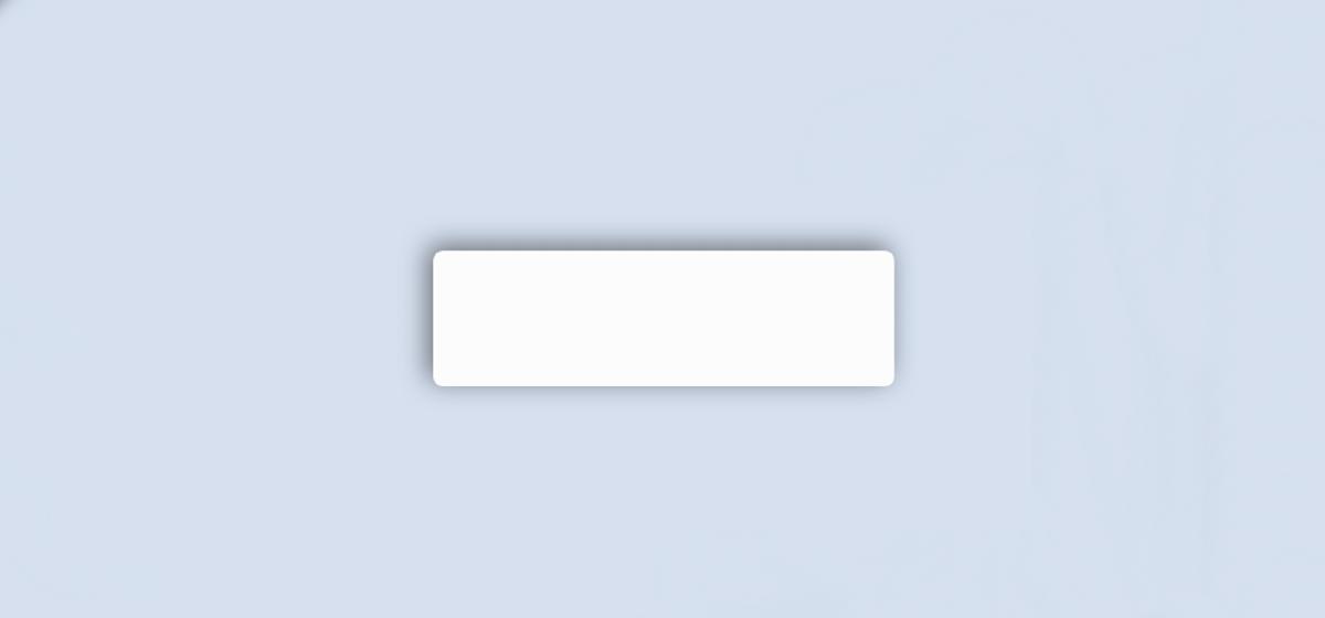
I have created a box on the web page using the following HTML and CSS code. The width of this box is 340px and the min-height is 100px. Here I have used white as the background color and box-shadow. The box-shadow helped create a black shadow around this card which made it more attractive and brighter.
Step 3: Add a profile image to the card
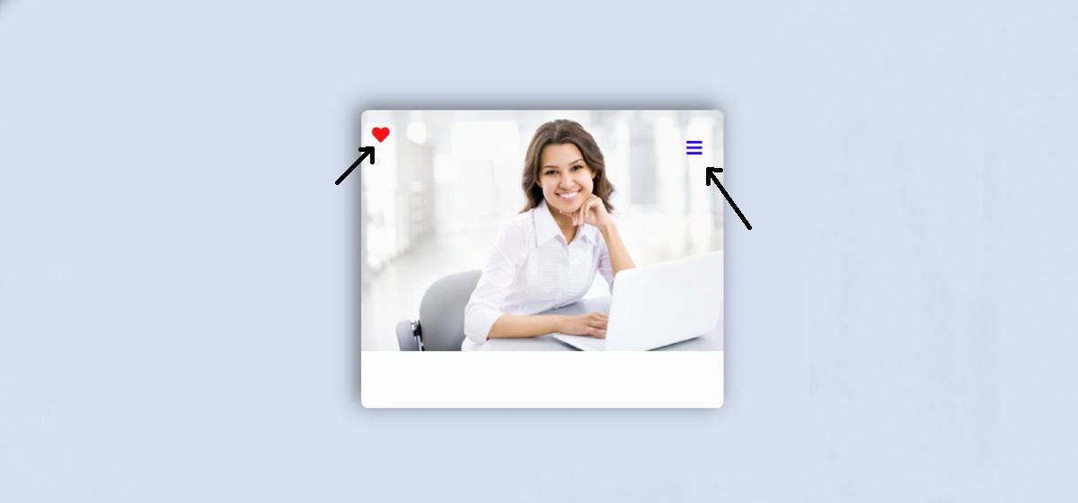
I added the image in this profile card using the HTML and CSS code below. As you can see above, first of all, I used an image here.
Step 4: Add icons to the image
Now I have added two icons to this card. One is the heart and the other is the menu bar icon. These two icons are floating on the image. Since these are icons of font-awesome, you must add font awesome CDN link in your Html file.
Step 5: Add title and basic information to the card
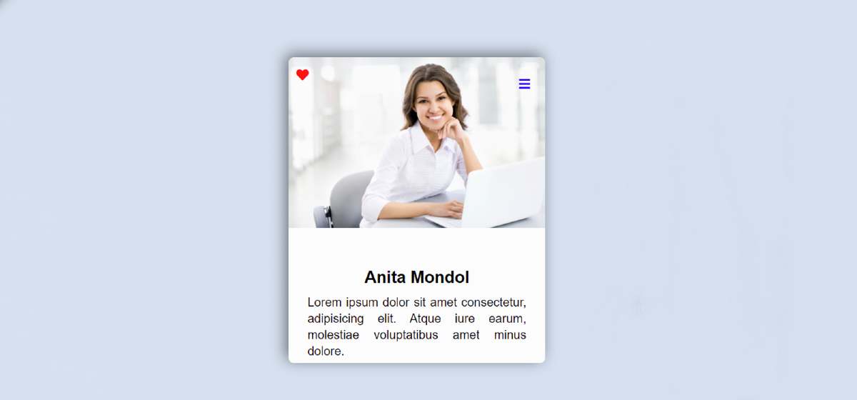
Using these codes I have added basic titles and some information. As you can see I used a title here in the demo above and gave some basic information. I have used the font size of that title as 22 px and the color is black. Text-align: center is used to place it in the middle.
Step 6: Add social media icons for contact
Now I have added its links on various types of social media. Here I have basically added five social media icons. I have used font-size 20px and color black of those icons.
Normally the color of the icons is black but it will change color whenever the icons are clicked and the mouse is moved. For this, I have added the hover color of each icon using CSS code.
Step 7: Create two buttons in a simple profile card
At the end of it all, I used two buttons. As you can see, there are two buttons, one for contact and the other for hire. I have used the width of these buttons 110px and the height 36px. Here I have designed the two buttons separately. I have given blue as the background color of the first button and white as the background color of the second.
Hopefully from the tutorial above you have learned how to make this profile card design. I have already shown many types of responsive profile cards using HTML and CSS code.
You can see those designs if you like this simple profile card UI design. If there is any problem, you can definitely let me know by commenting.

