
In this article, you will learn how to make Coin Flip Game using JavaScript. JavaScript Coin Toss Game is a great JavaScript project for beginners. This type of project will greatly increase your knowledge of JavaScript relationships.
I have previously created a variety of applications and games. Hope you like this Coin Flip Game tutorial like other tutorials. Here is the complete explanation for beginners. You must have played such games many times in your childhood. Besides, such a toss is done in different cricket matches.
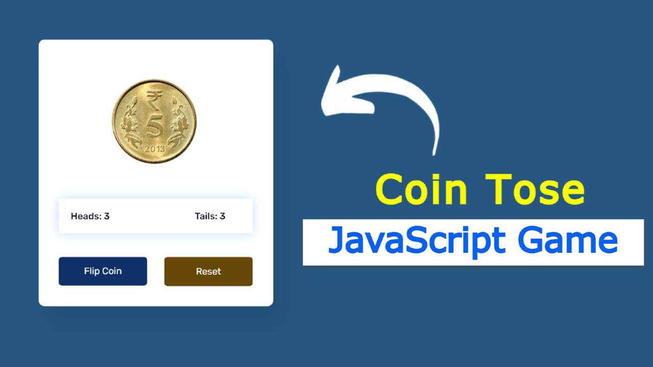
Here I have created a coin using two images. The head side of this coin is for this. For the upper tail direction. There is a button here. Whenever you click on that button, the coin will rotate many times along the x-axis. Then come to a certain direction and stop.
JavaScript Coin Toss Game (Live Demo)
Below is a live demo that will help you learn how this JavaScript Coin Game work. First I made a box. I put a coin in this box. I used two images to make the coin. In this case, you can use two images completely transparent or use a completely white background.
See the Pen
Untitled by Raj Template (@RajTemplate)
on CodePen.
I have created a box where the tail and head will count. Whenever you start this game and the result will appear in the box.
There are two buttons, one to launch the game and the other to restart the game. This coin will start spinning when you first click on the ‘flip coin’ button. Rotate for three seconds and then stop in a certain direction.
Coin Flip Game using JavaScript and CSS
Below is the tutorial on how to make this simple coin toss game using JavaScript. To make this game you must have a basic idea about HTML CSS and JavaScript. I have added images and some basic information with the help of HTML.
CSS has helped to design it perfectly and create a variety of color effects. Lastly, I used JavaScript which makes this head and tail game fully functional.
First of all, you have to create an HTML and CSS file then follow the tutorials below. If you want the source code, you can use the download button at the bottom of the article.
Step 1: Basic structure of Coin Flip
I created a box using the HTML and CSS code below. In this box, I have added all kinds of information like images, buttons, etc. Here we have used blue as the background color of the web page and white as the background color of the box.
I have used the width of the box 400px. No specific height is used here it will create its own height based on the amount of content. The border radius is used to make the four angles slightly rounded.

Step 2: Add head and tail coin to the game
Using the codes below, I have added images of heads and tiles in this coin toss game. As you can see above, this coin is made up of two images. You can change the images if you want. However, try to use your image transparent.
I used these images’ width 145px and rotated the tail image at a 180-degree angle along the x-axis. As a result, we will first see the head image. I can’t see the second image. The second image we see is when this coin is rotated 180. In a word, you can see the head on one side of the coin and you can see the tail on the other side.
Now I have managed to rotate this using @keyframes. If you look closely you will understand that in the case of transform: rotateX I have used different values in both cases. I have used 1980 for tail image i.e. I have used 2160 for the head.
I have used 180 ° more for the head image here. Because I had already rotated the tail image at a 180-degree angle. So in this case we have used less than 180-degree value in the case of the tail coin.

Step 3: Create a box to see the result of the game
Now we have created a display that will count the results of this game. Now I have only created displays using HTML and CSS. Later I implemented it with the help of JavaScript.

Step 4: Create two buttons
Now we have created two buttons to launch one game and to restart the other. The width of both buttons is 150px and the height depends on the padding.
Now I have designed the first and second buttons using the following codes. That means we have used different background colors and text colors here.
Here I have added some code using a tag called decibels. When you click on the flip button, the coin will continue to rotate for 3 seconds. This time I have disabled the button with the help of JavaScript so that it can no longer be clicked on. Now I have changed the background color and text color with the help of CSS.

Step 5: Activate the Coin Flip Game with JavaScript
Above we have designed this coin toss game using HTML and CSS. Now is the time to make it fully operational using JavaScript.
In the following three lines using JavaScript, I set the coin and the constant of the two buttons one by one.
Now I have set the value of head and tail to zero, which means that when the game is opened under normal conditions, both mean zero. Then when the game is played, its value will continue to increase according to certain rules.
Below I have added the code needed to flip this coin. Math.random is used here which will show any one of the heads and tails in a random way.
Here I have stored all the information in the constant called i. Here we have added complete information using the if function.
I used 3000 milliseconds using setTimeout at the end of it all. This means that the animation will continue to rotate for 3000 milliseconds, then a certain value can be seen.
Now I have activated the display. As a result, the value of the head or tail will continue to increase.
Now I have activated disable button.
The question may arise in your mind that there is no disable button here?
This coin flip animation will continue for 3 seconds when you click on the flip button. At that time this button will go into full decibel mode. So that I can’t click on it this time.
First I used ‘flipBtn.disabled = true’. Which indicates that the button will be disabled. Then I use setTimeout for how long the button will be disabled.
Now I have activated the reset button. The game will restart when you click on the reset button.

Hopefully from this tutorial, you have learned how to create Coin Flip Game using JavaScript and CSS. In the meantime, I have created many types of JavaScript games that will increase your knowledge about JavaScript.
Below is the required source code of this Coin flip simulator. Download the source code by clicking on that button.