

In this article, you will learn how to create Navigation Bar with Tooltip using HTML and CSS. Earlier I shared with you many more types of navigation and sidebar designs. This design is a little different here. A tooltip has been used in the navbar.
I used HTML and CSS to create the Tooltip with the navigation bar. Basically, it looks exactly like the menu bar. The difference is that you can see a pop-up text here when you hover over a menu item.
Some of the information in that menu item appears as a pop-up. This type of pop-up is called Tooltip.
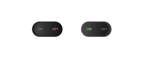
Simple Navigation Bar with Tooltip
In this article, you will find complete information and a tutorial on how to make a Simple Navigation Bar with Tooltip. For this, you need to have a basic idea about basic HTML and CSS. I designed the web page using CSS code. Here I have used blue as the background color of the webpage.
See the Pen
Untitled by Raj Template (@RajTemplate)
on CodePen.
Then I created a menu bar in which I used five menu icons. Under normal conditions, only icons can be seen. When you hover the mouse over it, the information in that icon can be seen in Tooltip. You can increase or decrease the number of icons here if you wish. The demo above has helped you learn how it works.
Now you create an HTML and CSS file. Below is the source code article needed to create this project (Simple Navigation Bar with Tooltip).
Step 1: Basic structure of Navigation Bar
I have created the basic structure of this navbar using the following HTML and CSS code. Here I have basically created a rectangular box where I will add all the icons. This box is 450px width and height: 80px. Border-radius: 50px helped to round the box.

Step 2: Add icons and tooltip to the navbar
Now in this menu bar with Tooltip, I have added the menu icons. Added Tooltip text to it. I have added all this information with the help of HTML. You must include the font awesome CDN link in your Html file to make these icons work.
I have designed the icons using the following CSS. I have used a little blue color of the icons here and used font-size: 24px to increase the size.

Now I have added a hover effect on this icon using CSS codes. The color of the icons will change whenever you click on these icons or move the mouse.

Step 3: Design the Tooltip in the Navigation Bar
Now I have designed the CSS Tooltip. Above we added all Tooltip information using HTML. Now I have designed it beautifully. Here we have used position: absolute so that it has a fixed position in a place. The top and lept have also helped to keep it on top of anything.
Its width is 115px and height depends on the padding. I used a border-radius to make it round. I have used display: none at the end of all which will hide this Tooltip under normal conditions.
Now I have implemented this Tooltip. The Tooltip of this Navigation Bar can be seen when you hover the mouse over it. Here I have used display: block which indicates that the Tooltip of these icons can be seen.

Step 4: Add an arrow to the CSS Tooltip
Now I have added an arrow in Navbar With Tooltip On Hover. If you notice the demo you will notice that there is an arrow mark at the bottom of this Tooltip which adds to the beauty. I used the ‘before’ tag of CSS to make this arrow.

Hopefully from this tutorial, you have learned how to create a Simple Navigation Bar with Tooltip using HTML and CSS. I have shared many types of navigation and sidebar designs before. Below is the source code needed to create this Navbar With Tooltip On Hover.