
In this article, you will learn how to create a responsive sidebar menu bar using HTML CSS and JavaScript. Earlier I shared with you the design of many more types of responsive side navigation bars. I took the help of HTML CSS to create the basic structure of the Simple Sidebar. The menu buttons here help Javascript to work.
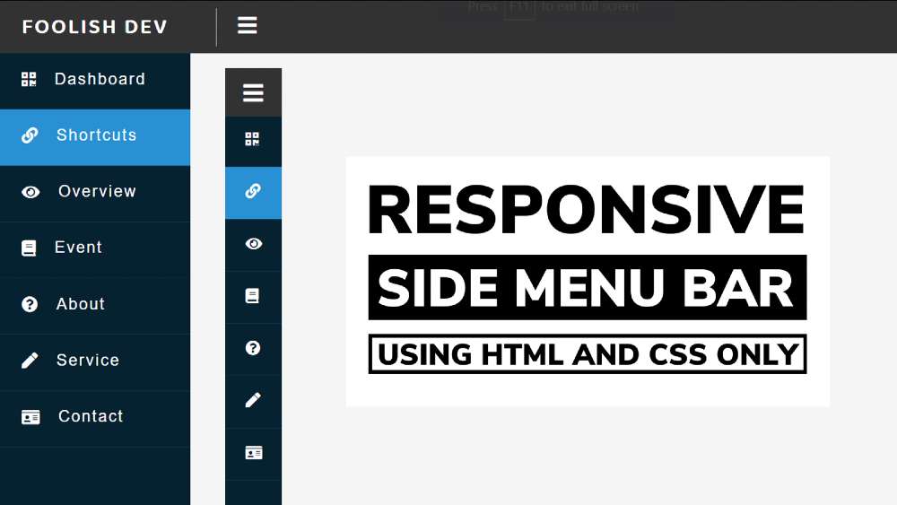
At first, I created a top bar but did not add any menu items. Just added a logo here and it has a menu button. I’ve added a number of menu items to the sidebar, each with an icon. Under normal circumstances, only icons can be seen and text cannot be seen.
Responsive Sidebar Menu in HTML CSS
Nowadays menu bar is a very important element for any website. Different websites use a top menu bar and some websites use top and side two types of menus. Undoubtedly the sidebar is much more attractive and attracts the attention of the user.
The width of the sidebar is 220px but in the normal case, its width will be 70px. When you click on the menu button here, you will see the icons with full text and the width of the sidebar will be 220px. In the case of small devices, this design (sidebar menu HTML CSS) can completely adapt itself.
Hopefully, the video above has helped you to know how it works. To build it you must have a basic idea of HTML CSS and JavaScript.
Here is a step-by-step tutorial for beginners with a video where we have shared the complete tutorial. There is also a download button at the bottom of the article to download the source code.
Step 1: Sidebar’s basic code
Using the HTML and CSS code below, I have created the basic structure for this sidebar. All HTML code will be added to this HTML structure.
Step 2: Basic structure of the top menu bar
I have created the top menu bar with the help of the following codes. Here I have used the width: 100% and height: 60px of the top navigation bar. The background color is black and ‘top: 0’ and ‘left: 0’ are used to place it on top of the web page.

1. Create a logo using text
Now a logo has been added to this top bar. I have added this logo with the help of text. Background width of this logo: 250px and font-size: 25px.

2. Create menu button
Now I’ve added a menu button to this topbar that will help you see and hide the text in the sidebar. I put the icon after the logo and used font-size: 25px.

Step 3: Basic structure of responsive sidebar
Now I have used the following code to create a sidebar. Sidebar’s height: 100%, width: 220px and here background-color I have used deep blue.

The following CSS code has narrowed the width of the sidebar and managed to hide the text. As a result, only icons can be seen under normal conditions. When you click on the menu button, both the icon and the text will appear.

Step 4: Add menu item in side-navigation bar
Now I have added menu items in the Responsive Sidebar. 6 icons and text have been used here. You can increase or decrease the amount if you want.
Padding: 16px 25px is used to keep some distance between menu items and a light border is used under each icon.

Step 5: Activate the Responsive side navigation bar
Some class functions are determined using the following 3 line code.
This project () can increase the width of the menu bar in two ways
➤ Hover over the menu bar
➤ Click on the menu button
With the help of some code below, I have arranged to activate the menu bar through hover.
Using “mouseenter” and “classList.remove” below I have indicated that “hover_collapse” will be removed from the sidebar when the mouse is moved into the sidebar.
Removed “hover_collapse” resulting in ‘width: 70px;’ And ‘.text {display: none;}’ These two conditions will be removed from the sidebar.
As a result, the width of the sidebar will be 220px and the text can be seen.
What happens when the mouse is removed from the sidebar is determined by the code below.
Now using “mouseleave” and “classList.add” I have instructed to add “hover_collapse” to the sidebar. This means that when the mouse is removed from the sidebar, the width of the sidebar will be 60px and the text will be hidden.
Now I have managed to activate the menu button. When you click on the menu button, “hover_collapse” will be added and removed. The first click will be removed and the second click will be added. As a result, we get to see the full sidebar.

Hopefully from this tutorial, you have learned how I created sidebar menus using HTML CSS, and JavaScript. If you want to see more designs like this, you can search my blog.
The source code for creating this project (Responsive Sidebar Menu using HTML CSS and JavaScript) includes the download button below.