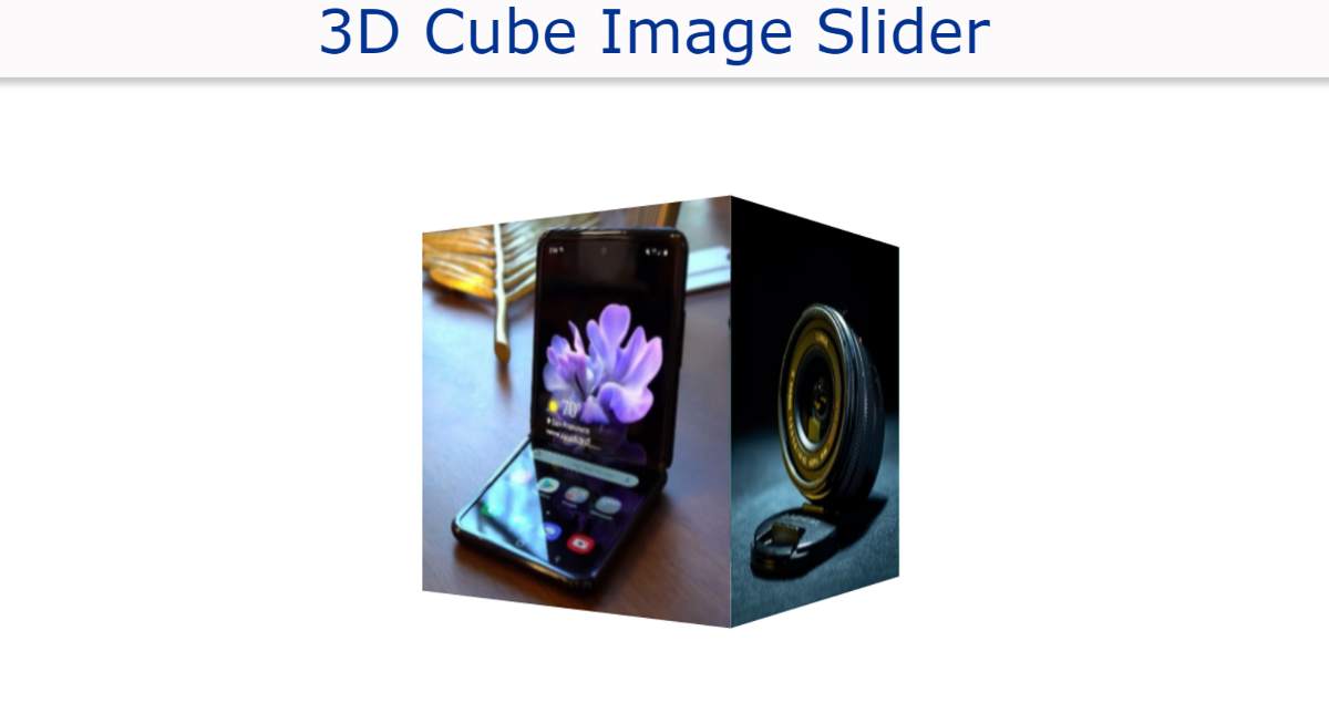

Image Slider You may have seen a lot but this 3D Cube Image Slider will attract you a lot more. This CSS 3D Cube Image Slider is in the shape of a cube around which the image can be seen.
It continues to rotate at a 360-degree angle along the Axis. As a result, every now and then we see each image. Four images have been used on each side of the cube. This slider will take 16 seconds to rotate 360 along the x-axis.
CSS 3D Image Slider
See the Pen
Untitled by Code Media (@codemediaweb)
on CodePen.
We can see each side of the cube for four seconds. Earlier I shared with you the design of many more types of 3D Cube Image Slider. Some of these are image slider manuals and some are automatic.
Step 1: Image slider’s background
I have created the background of this 3D image slider with the help of HTML and CSS code below. Since it is cute, both width and height are equal. Here width and height 240px is used and background blue is used.

Step 2: Add images to the 3D slider
Now I have created four images in this cube. The width of the images is kept equal to the size of the cube. The images here are width and width 240px.

Step 3: Arrange the images with each other at 90 angles
The images I added above are in one place. Now those images have to be arranged 90 degrees apart along the y-axis. Here, using Transform, I put the first image at zero degrees and the second image at 90 degrees. As a result, the first image is on one end of the cube and the second is on the other side of the cube.
It is the side of a cube located at a 90-degree angle to each other. Here the images are similarly arranged with each other at a 90-degree angle.
Step 4: Arrange for the cube to rotate
Above we set a time of 16 seconds to rotate. That means the whole cube will take 16 seconds to rotate 360. Here each image can be viewed for 4 seconds. It will take 16 seconds to get from zero to 100% here.

Hope you learned from this tutorial how I created this 3D image slider using HTML and CSS. Below you will find the source code needed to create this CSS image slider.