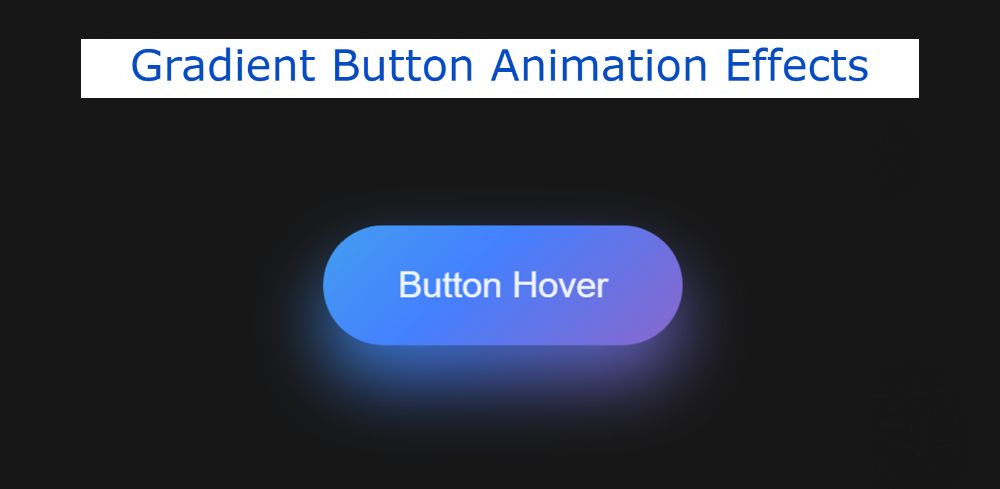

This tutorial will help you learn how to create Gradient Button Animation Effects using HTML and CSS. Earlier I shared with you the design of different types of button animation. Notable among them are Neon Animation, Glowing Gradient Button, etc.
However, this tutorial will help you to know how to add gradient animation between the buttons. Distribution is one of the many HTML elements that we use in different places. Buttons are used in almost all types of websites or web pages for various reasons.
However, the more attractive and modern the button, the sooner it will attract the attention of the user. There is no comparison of CSS Gradient Buttons in terms of attention and professionalism.
Gradient Button Animation Effects CSS
Pure CSS Gradient Button uses a variety of colors. This type of Gradient Button Animation Effects is used in various affiliate programs or any link that needs to be noticed by the user.
Different types of colors can be seen in the background at certain time intervals. It’s easy to make if you know basic HTML and CSS. You can also create such buttons with the help of button function or using normal HTML elements.
See the Pen
Untitled by Foolish Developer (@foolishdevweb)
on CodePen.
Hopefully, the demo above has helped you to know how this gradient button hovers effects work. You will get the source code above if required. However, I have given a button below to download the source code.
Related Post:
1. Loan Calculator using JavaScript
2. Show and Hide Password Using jQuery
3. Save Text to a File using JavaScript
4. Simple Weather App using JavaScript
5. BMI Calculator using Javascript
6. Simple Stopwatch using JavaScript
Since this is a very simple element, I did not share any tutorial for it. No click or hover effect has been added to this button. This CSS Gradient Button will automatically run this color change process for endless infinity time.
How to Create CSS Gradient Button Animation
Now is the time to create this button animation. To do this, first, create an HTML and CSS file. Then add the following codes to that file. Only two lines of HTML and some amount of CSS are used here.
You copy the following HTML code and add it to your HTML file. Only one text is used in the HTML below which can be found within the button. If you want to change the text of the button, you can do so here.
CSS Code:
Now it’s time to add color and animation to this Gradient Button with the help of CSS. Copy these ECSs and add them to your CSS. First I used black as the background color of the webpage. As a result of using black, the animations of this button can be seen very clearly.
Although you can change the background color when using it in your project or work. The width of this button is 300px and the height is 100px. Different colors have been added at 50-degree angles using a background linear gradient.
Hopefully, you have no problem using the above HTML and CSS codes. And using these codes you can create this Gradient Button Animation Effects CSS. If you have difficulty understanding these codes, please let me know in the comments.
If you want to download the source code, you can use the button below. You can download the source code to create this CSS Gradient Button with a single click.