

In this article, you will learn how to create a Responsive Automatic Image Slider using HTML and CSS. Earlier I shared with you the tutorial on different types of image sliders. Earlier I shared the design of the Automatic Image Slider with you but it was not responsive.
This design is fully responsive. This allows you to use this design directly within your website or project. I used HTML, CSS, and JavaScript to create this Responsive Automatic Image Slider.
I designed this slider using HTML and CSS. I’ve used JavaScript here to automatically convert images. I have not shared any tutorial here. If you want to know step by step then you can see other designs made by me.
Responsive Automatic Image Slider in HTML
Below I have given a demo that will help you to know how Responsive Automatic Image Slider works.
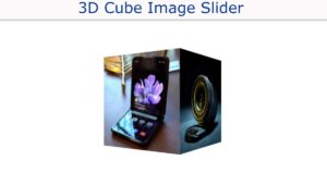
See the Pen
Untitled by Foolish Developer (@foolishdevweb)
on CodePen.
As you can see above, the first web page was designed. Then a box is created which will contain the images. Then the indicator is used here. This indicator will help to know which image is open. Here five indicators are used for 5 images.
If the first image is open, the first indicator will be highlighted and if the second image is opened, the second image will be highlighted. You cannot change the image with this indicator.
To create this Responsive Automatic Image Slider in HTML you need to have a basic idea about HTML, CSS, and JavaScript.
How to Create Responsive Automatic Image Slider
First, you create an HTML and CSS file then add the following codes to the file. For this, even if you do not create a separate JavaScript file. Copy the HTML code below and add it to your HTML file.
Be sure to add the code to the body section of the basic structure of your HTML. I have added the required images in the HTML. You can change the images if you want.
HTML Code:
The following codes are the CSS codes used to design the image slider. You copy these codes and add them to your CSS file. Be sure to attach the CSS file to the HTML file.
CSS Code:
This Responsive Automatic Image Slider uses a small amount of JavaScript to automatically change the images. You can create separate files to add these JavaScript codes.
You can also add codes to HTML files using script tags. Here the time is set to 2000 milliseconds using setTimeout. That means the images will change every 2 seconds.
JavaScript Code:
Hopefully using the above HTML, CSS, and JavaScript codes you have learned how to create this Responsive Automatic Image Slider. If there is any problem then you can take the help of the download button below the article.
If you want to know step by step how to make an Automatic Image Slider then you can see other designs made by me. Please comment on how you like this Responsive Automatic Image Slider in HTML.