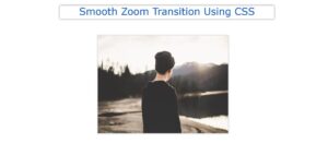
In this article, you will learn how to create Simple Image Hover Effects using HTML and CSS. I have already shared various types of image sliders and image hover effects before this tutorial. The Simple Image Hover Effects that I have seen here are completely unique.
Here the image will take the shape of a closed book. Under normal conditions, we can see the image along the perpendicular. When the mouse is moved over the image, the image becomes parallel to the ground.
Simple Image Hover Effects CSS
I used CSS and HTML to create this image hover effect. Very little HTML is used here and the rest is CSS. This has created more of an image effect using HTML. Necessary images and effects have been added with the help of CSS.
Below I have given a demo that will help you to know how this simple image hover works. Here you will find the required source code and live demo. You can use the demo section to get the source code or you can use the download button at the bottom of the article.
See the Pen
Untitled by Foolish Developer (@foolishdevweb)
on CodePen.
How to Create Image hover Effect in CSS
As you can see in the demo above, this is a cool image hover effect. Under normal conditions, the image is perpendicular. If you hover over the image, the image will move parallel to the ground. First I used gradient color in the webpage. Then I added the image.
Since this is a basic project, I have not shared a step-by-step tutorial here. I just gave the source code. First, you create an HTML and CSS file then add the following code to your file. Copy the following HTML code and add it to your HTML file. Very little HTML has been used here.
CSS Code:
Now is the time to design and implement this Simple Image Hover Effects CSS with CSS. Here I first designed the webpage and added different background colors to the webpage. Then I added an image with the help of CSS.
Then before, after using it it has been given the shape of a book. Copy the CSS code below and add it to your CSS file. Be sure to include the CSS file in the HTML file.
Hopefully, you have been able to create this Simple Image Hover Effects CSS using the codes above.
If the above codes are difficult to use or do not work then you can take the help of the download button below. This cool image hover Effects CSS you must know how you like it by commenting.


