
In this article, you will learn how to create Rain Animation Effects using CSS and javascript. You will see this kind of CSS Rain Effects animation in different places. Creating this effect is much easier if you know basic CSS and javascript.
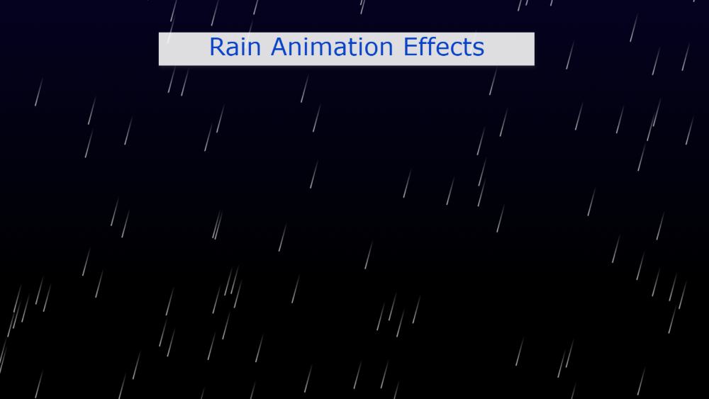
This type of Rain Animation effect is used in the background of different projects or elements. The black color of the webpage background has been used to create this CSS animation rain. Then the point of white water is falling from top to bottom. Although JavaScript has been used to make it work.
Pure CSS Rain Animation Effect
Here you can use color instead of white color which is more beautiful and attractive. This design is used in the background of various projects which basically helps to enhance the beauty.
Below I have given a demo that will help you to know how it works. Live Demo 👇👇
See the Pen
Untitled by Foolish Developer (@foolishdevweb)
on CodePen.
As you can see above a lot of water droplets are falling from the top to the bottom on a gradient background. This project looks very difficult but it is very easy to make. This beautiful CSS rain animation with Lightning can be created with very little code.
If you only want the source code, you can use the download button below the article. And use the demo section above to get the live demo.
How to Create Rain Animation Effect using CSS
Below I have shown with some steps how I have created Rain Animation Effects using CSS. No HTML code is used here.
These animations can be seen in the background of the webpage. So the body tag of the webpage has been used. So there is no need to use any HTML separately.
Step 1: Design the webpage
I designed the web page using the following CSS codes. Here a black linear gradient is used on the webpage.

Step 2: Design the raindrops
The raindrops are designed using the CSS below. The question will arise in your mind if no tag called hr is used here then what CSS am I adding. In fact, I will add this hr tag with the help of JavaScript.
Animation has been used with this meaning that it has to be added how these raindrops will fall from above. Here 1 second is used during animation.
The following @keyframes are now used to make the animation I added above work.
Step 3: Enable Rain Animation using JavaScript
Above we have done all the design work. Now is the time to implement it with JavaScript. If you know basic JavaScript you can easily understand it. First I determined two constants called hrElement and counter. Here the counter value is 100.
I have added the following calculations of how these raindrops will spread from top to bottom.

Hopefully from the above tutorial, you have learned how to create these Simple Rain Animation Effects. CSS and JavaScript have been used to build it.
If there is any problem to create this pure CSS rain effect then you can definitely let me know by commenting.