
In this article, you will learn how to create Responsive Contact us Form using HTML and CSS. Contact form we use in different places. This type of Responsive Contact us Form is used to contact the website owner on different websites. Where the user can send his necessary information or message to the author or web owner. Here I have used only HTML and CSS.
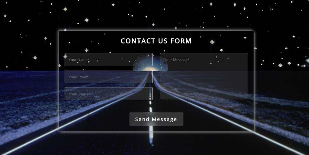
This contact form is fully responsive. This will allow you to use this contact page directly within your website or projector. This contact form is very simple. This is what I have made transparent so that the background can be seen clearly. This type of transparent design enhances the beauty of the website.
Responsive Contact Us Form
Below I have given a preview that will help you to know how this Responsive Contact us Formworks.
See the Pen
Untitled by Foolish Developer (@foolishdevweb)
on CodePen.
As you can see above I first added a background image to the webpage. Then I created an area of contact form here. The background of that area is completely transparent.
First of all, I used a heading then 3 input boxes were used. The input boxes are for inputting name, email, and phone numbers respectively. Then a box is created using textarea to input the message.
The most important point is that it is Responsive. Some CSS has been used to make this contact us form responsive. This allows you to use this design directly in your project. To create this Responsive Contact us Form you need to have a basic idea about HTML CSS.
How to Create Contact Us Form in HTML
Below I have shared step-by-step tutorials. If you only want the source code, you can use the download button at the bottom of the article. You will also find all source codes in the demo section above.
Here I have shared step-by-step tutorials and shown the possible results after each step. Which will help you to know what kind of results can be seen after using that code.
Step 1: Basic structure of form
Using the HTML and CSS codes below, I created the basic structure of the contact form and designed the webpage.
First I designed the web page using some amount of CSS code and used a background image here. Here you can change the background image to your liking.

The basics of this contact form have been designed using the following codes. The maximum width of this form is 500px and box-shadow has been used to enhance the beauty.

Step 2: Add headings to the Contact Form
I first created a heading using the following HTML and CSS codes. This heading is basically to enhance the beauty. For this, I have used the h2 tags of HTML.

Step 3: Add contact us Form information
Using the codes below I created all the input spaces and created a button. First, create three input boxes on the left side and then create a text area on the right side. There is a button at the end of all.
I designed the places by input using the following CSS codes. Here a border has been used around each input area and the background has been blurred.

Using the following CSS I have determined the size of the place to input the message.

Step 4: Design the Contact Form button
Now it’s time to design the button. Here the width of the button is 200px and some of the background colors have been blurred. I used font-size: 18px to increase the text of the button.

Step 5: Make the Contact us Form Responsive
Above we have designed the Responsive Contact us Form. Now it has to be made responsive with the help of CSS.
The maximum width of the screen used here is 460px. In other words, the following codes will be applied in case of screen sizes below 460px.

Hope you learned from the above tutorial how I created this HTML contact form. Earlier I have shared with you many more types of registration forms, login forms, tutorials of contact forms.
You must comment on how you like this Responsive Contact Form HTML CSS.