
In this article, I have shown you how to create Simple Button Hover Effects using HTML and CSS. Buttons are used in different places on any website. In this tutorial, you will learn how to make simple button hover effects CSS.
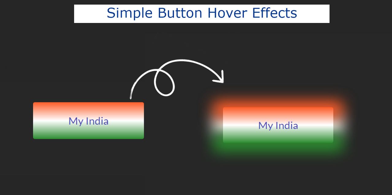
Animated buttons are much more interesting than ordinary buttons. Added hover effect to this button. When the mouse is moved over the button, some changes will be made to the button.
I have designed this button with the color of the Indian flag. In other words, the color of the Indian flag has been used in the background of the simple hover button CSS.
Simple Button Hover Effects CSS
When hovering over that button, the back of the button can be seen as the color shadow of the button. You can use this Simple Button Hover Effects in any of your buttons. Undoubtedly this CSS button hovers effect will make your button more beautiful.
Below is a demo or preview that will help you to know how this button hover works.
See the Pen
Untitled by Foolish Developer (@foolishdevweb)
on CodePen.
As you can see above, there is a button that uses the color of the Indian flag in the background. That is, the first ocher, then white and then green has been used. I have used a text here.
I used a small amount of HTML and CSS to make it. If you only want the source code, you can use the download button at the bottom of the article. However, I request you to follow the tutorial below.
Step 1: Basic structure of button hover
Button’s basic information has been created using the following HTML and CSS codes. Here I have used a text that you can change the text to your liking.
Background color black has been used here. When you use it in your project, you can change this color to your liking.

Step 2: Design the button with CSS
The following codes have been used to change the size of the button in the text added above. Font-size: 22px has been used to increase the width: 230px, height: 80px and text size of this button.

Step 3: Add color to Button’s background
The background color of the button has been added using the CSS below. Here three colors are used using linear-gradient which is required for the Indian flag.

Step 4: Add Hover Effects to Button
Now Hover Effects has been added to the button using the following CSS. Now only white color is available as a result of hover.

The following CSS codes have been used to add the two colors above. Below are the arrangements for viewing the ocher and green color backgrounds respectively.
As a result, when you hover the mouse over that button, you will see three colored shadows in the background.

Hope you learned from this tutorial how I created these Simple Button Hover Effects using HTML and CSS. If you have any problem then you can definitely let me know by commenting.
If you just want to download the source code of this simple button hover Effects CSS then use the button below.