If you want to create CSS Custom Toggle Switch then this article is for you. In this tutorial, you will learn step by step how to create Custom Toggle Switch using HTML and CSS. This type of toggle switch can be easily created using the type = “checkbox” of the HTML input.
In the meantime, I have seen how to create a CSS toggle switch with text. Although this design has been created in a completely different way. This HTML toggle switch is designed for day-night turn buttons. Among the various websites, we see the Night Mode button. This design would be perfect for making that kind of button.
This is much more advanced than a switch made by a simple type = “checkbox“. Different types of color effects and animations have been used here. First I created the basic configuration of this switch using HTML checkboxes.
Then added different types of CSS effects and added different animations here. There are two types of modes used: day and night.
CSS Custom Toggle Switch
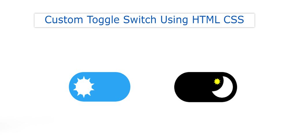
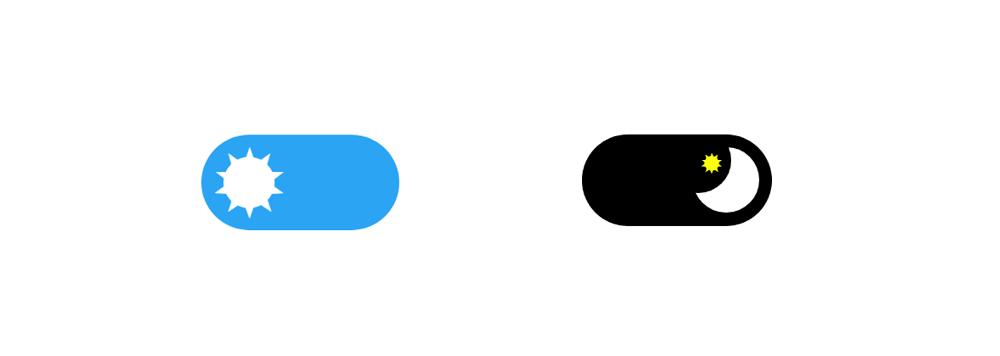
Day mode will be in default when this switch is opened. This will cause the switch to have a blue color in the background and the sun to be seen. This Sun will be along the left side. This sun is custom made using CSS.
When you click on that checkbox switch, the sun will move to the right and the sun will turn into the moon. In the case of night mode, the background color will be black and a moon will be seen.
See the Pen
Day And Night Toggle Switch by Shantanu Jana (@shantanu-jana)
on CodePen.
As you can see above the Toggle button has been created in a very simple way in this day and night mode. Although using such buttons I have shown a project which will help you to know how to use this CSS Toggle Switch practically.
How to Make Toggle Switch Using HTML CSS
Here I have shared a step-by-step tutorial and show how I made it. If you just want the source code to create this project then use the download button below the article.
Follow the step-by-step tutorial below and find out how I created this Custom Toggle Switch.
HTML code of Toggle Switch
Below I have given all the HTML codes together. First using the input checkbox I created the basic configuration of this switch. Then I added some basic elements to make the sun and moon.
Design the toggle button’s background
I first designed the webpage using the following codes. Here display: none is used for checkboxes. As a result, we do not see the checkbox in its normal state.
Now the following codes have been used to give this checkbox the shape of a switch. Border-radius: 56px has been used to make this CSS Toggle button width: 116px, height: 56px, background-color blue and round.
Day mode of Toggle Switch
Now you have to make the sun in a custom way. For this, we used some star symbols in HTML. The sun will be created here using those signs.
To create the sun, first, a circular circle is made and then the star marks are placed in that circle in such a way that it looks like it is a sun.
Night mode of Custom Toggle Switch
The work of making the sun above has been done, now we have to make the moon. Because we used two modes here.
The first is for the day where the sun can be seen and the other is for the night where the moon can be seen. The moon has been created using the CSS below and a small star sign has been added to this moon.
Note that this Custom Toggle Switch is not currently operational. As a result, we will not be able to see this result at this step. Because after executing it, day mode will be converted to night mode.
Activate the CSS Toggle button
Now is the time to fully activate this CSS Toggle Switch. This means that what changes will occur when you click on this button is added here.
Hopefully, you have learned how to create this CSS Toggle Switch using the code above. In the meantime, I have shown you how to use this type of button practically.


